Creating a new identity system for Coop
Identity system and visual identity for Coop Danmark
Coop Denmark has for years been on a journey from an anonymous holding company to becoming a brand known by most Danes. Coop symbolises the common denominators for all the brands in the Coop family being accountability, responsibility and sustainability. And in recent years, Coop has become a progressive corporation with a strong voice in societal and political agendas. Among others, Coop called on Danish authorities to ban disrupting chemicals, and Coop’s major food suppliers must now commit to ambitious targets for reducing the climate impact of groceries. Furthermore, Coop has an ambitious climate target, and they are working toward CO2e emissions from their operations are reduced by 75% in 2025, and Coop’s operations will be climate positive in 2030.
Project details
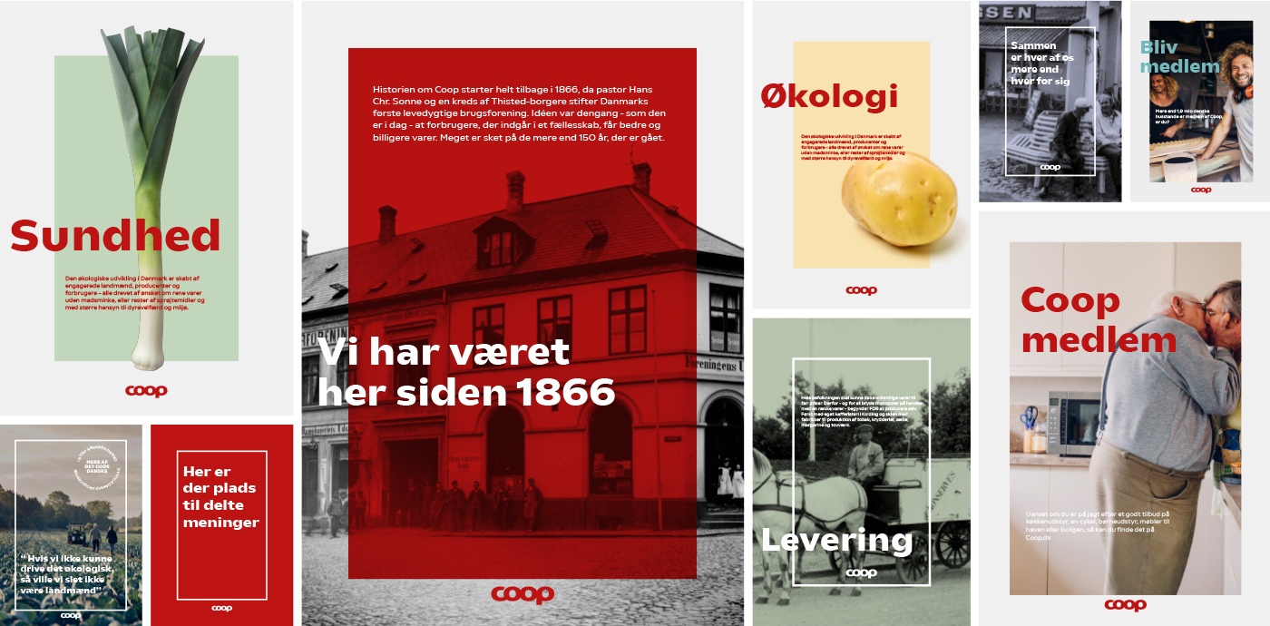
Over the last five years, we have worked closely with the top management in Coop on several corporate and brand strategy projects, as well as the development of visual identities and design solutions at product, private brand and chain level. Our task was to develop an identity that represents the spirit, heritage and DNA of this complex organisation while being suitable for several very different business units, ranging from supermarket chains, insurance products and banking to a crowdfunding platform, to mention a few. The Coop visual identity represents the “shared space” – What all the Coop brands have in common.
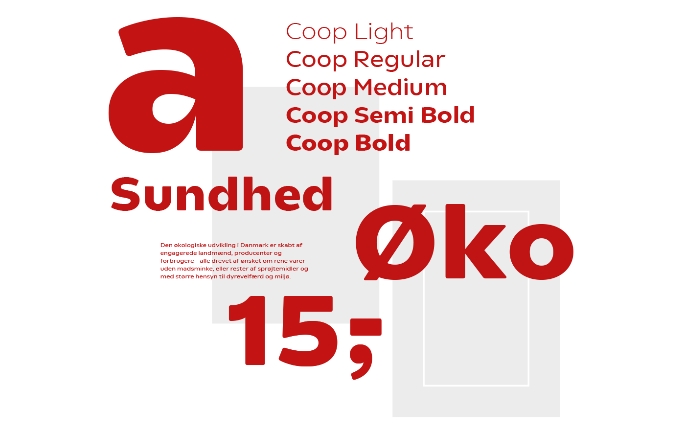
Quite early in our work with the Coop visual identity, it became clear that the optimum for Coop would be to develop its own font. In doing so, Coop would get a font that expresses and support their DNA and support the common thread between all Coop’s activities across channels and media. Furthermore, having a custom typeface can enhance both distinctiveness and recognition. Due to the complexity of the organisation, our task was to create a typeface that holds both the seriousness of banking and the boldness of a good price that could fit on a sign in the middle of the green department in a grocery store.
New initiatives with focus on convenience and high quality
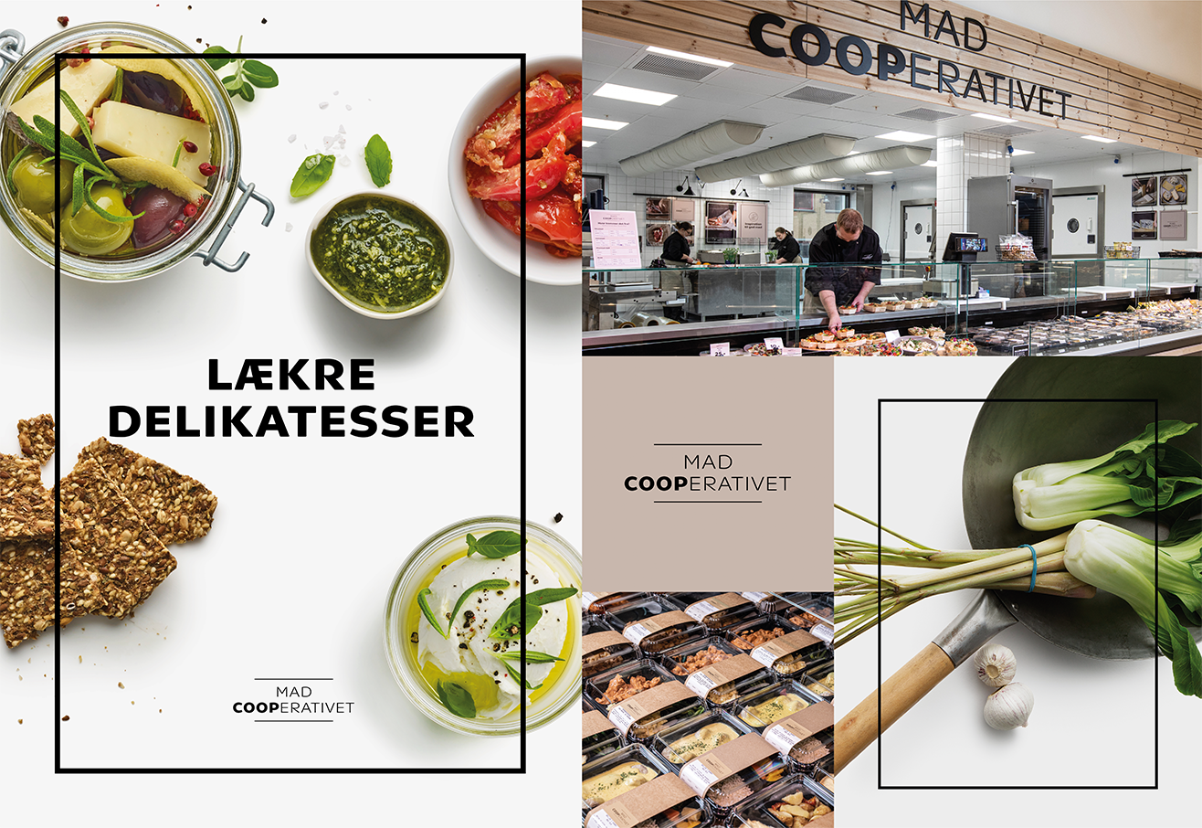
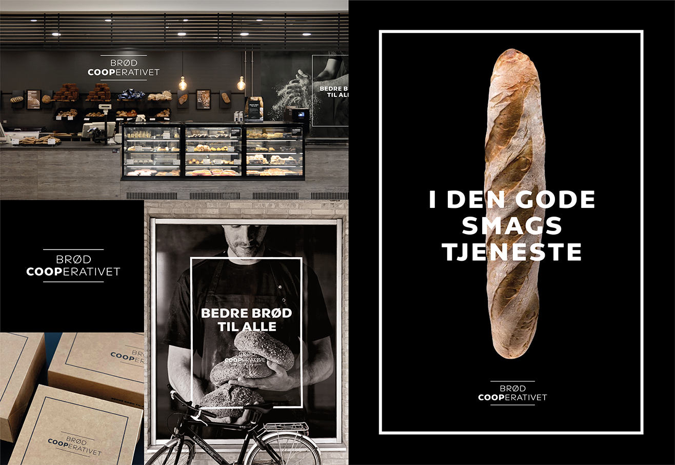
In response to the fierce competition in the grocery sector in Denmark, Coop has launched several initiatives over the last couple of years. Focus has largely been on convenience and high quality and MadCooperativet and BrødCooperativet are two of those initiatives. We redesigned these brand identities to ensure that they are coherent with Coop’s corporate visual identity while having the necessary flexibility to easily adapt to Coop’s various grocery chains reaching from hypermarkets to small local supermarkets.
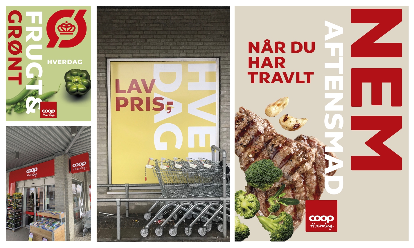
Testing new positions in the market
One of the things we highly appreciate about our partnership with Coop is their courage. They are willing to conduct real-life tests of new strategic positions while developing their strategy to secure future growth and profit for the company. For example, Coop tested two new positions for the well-known Superbrugsen and Fakta; Coop Mad and Coop Hverdag. We highly welcome Coop’s courage and willingness to take drastic steps to ensure a future that holds both Coop’s purpose and responsibility towards us as consumers. As part of extensive cooperation, we developed the two test identities placed in the city of Trekroner to test the new concepts and position in the market.