Packaging is identity at shelf
Brand identity and Packaging design for Irmas & Irmas hverdag
In 2018, the Danish high-end supermarket Irma implemented a new strategy, “The Urban Irma”, and as a result, we have updated their visual identity to fully support their new positioning. As a continuation thereof, we have created a new packaging design for Irma’s two own labels, “Irma’s” and “Irma’s hverdag”.
As we say – Packaging design is identity at shelf.
Project details
Irma has two quite successful private label product lines. However, there was a need for an easier distinction between the two lines – between good and better. The Irma customer is a little spoiled, as they are used to high-quality products, deluxe urban supermarkets and lots of art, as Irma has a tradition of working together with local artists. Furthermore, Irma decided to expand the “Irma’s hverdag” product line significantly to attract new segments and meet more consumer needs.
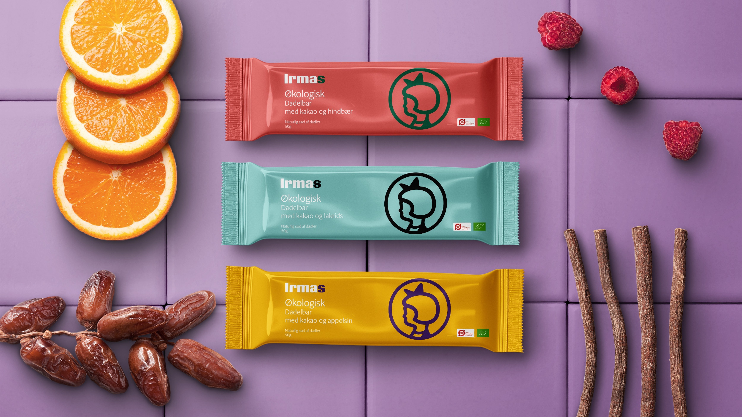
The task was to design two product lines that were easy to distinguish, making it easier for consumers to choose. We solved this by creating two very different expressions – one being very colourful with lots of ”flavour”, interesting images and the Irma circle-girl in front, and the other with a more graphic expression and the renewed checker pattern. Overall, Irma uses a lot of colours, combined in bold compositions leaning towards the artistic form which is a part of their DNA.
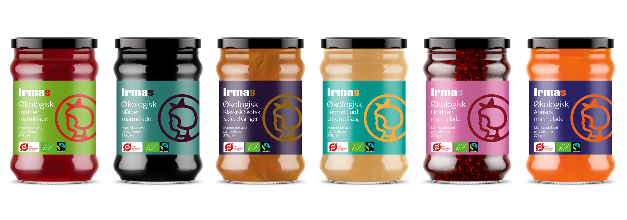
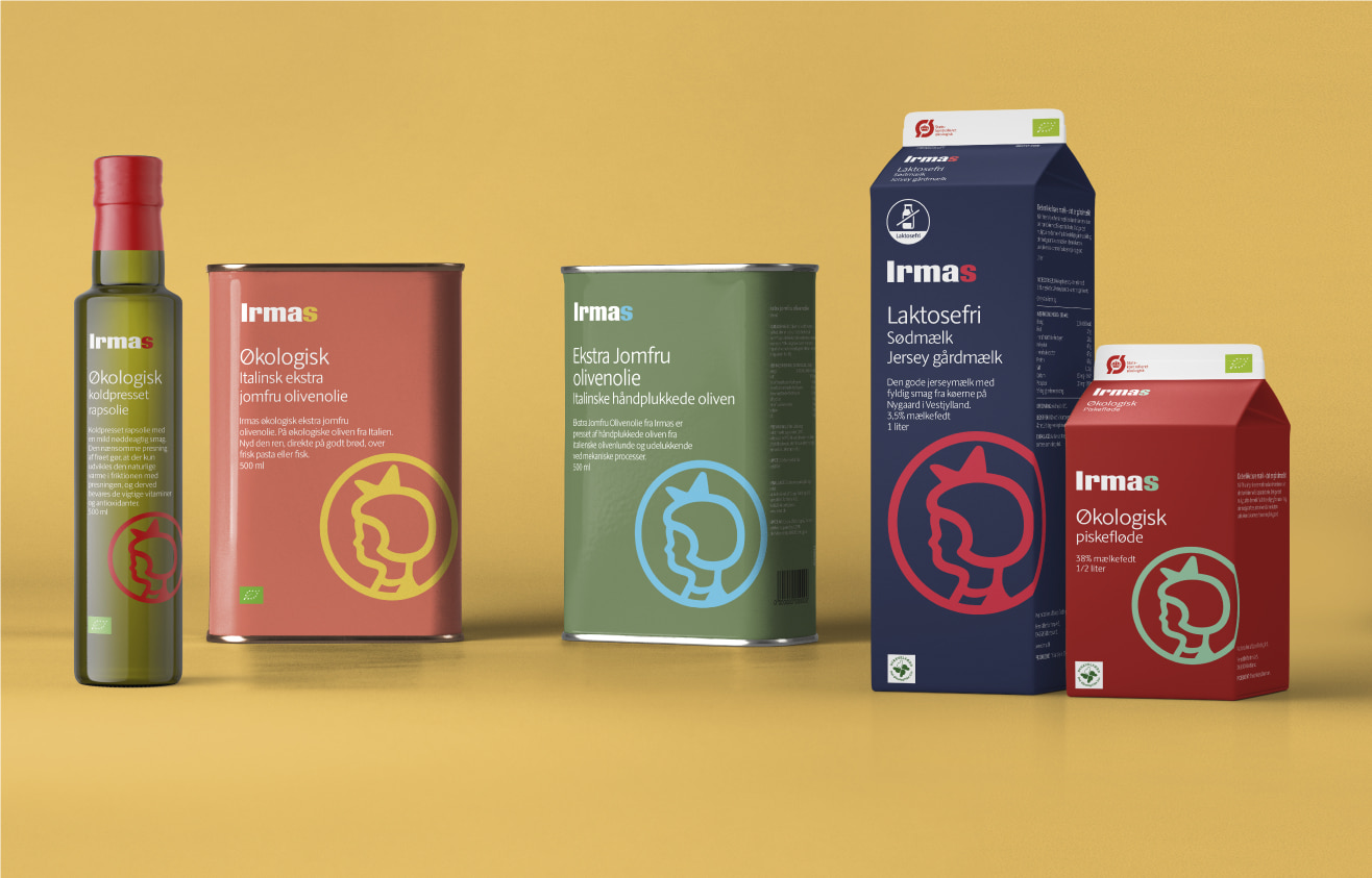
The “Irmas” product line is the visual identity manifested in its packaging design. Therefore, the curiosity in the brand is intensified through the use of colours in a modern expression.