Rebranding for expansion
Brand strategy & packaging design for DentaCure, Fenucure Medical
For many years, Fenucure Medical has developed oral and dental care products based on a natural anti-inflammatory and antibacterial extract from the fenugreek plant, which effectively helps to reduce and prevent gum problems. They were on a journey towards an expansion of both the product portfolio as well as expansion into new markets. We have contributed to the strategically brand postitioning as well as with the packaging design of the new product series.
Project details
For a company operating in a medical market with a natural ingredient as the primary effective ingredient, it presented us with some interesting strategic considerations concerning the positioning of the products. For example, should the product be positioned as “the effective alternative on the natural shelf” or “the natural alternative on the effective shelf”, and how could the design be balanced to instinctively place itself in a clearly decodable position on the shelf?
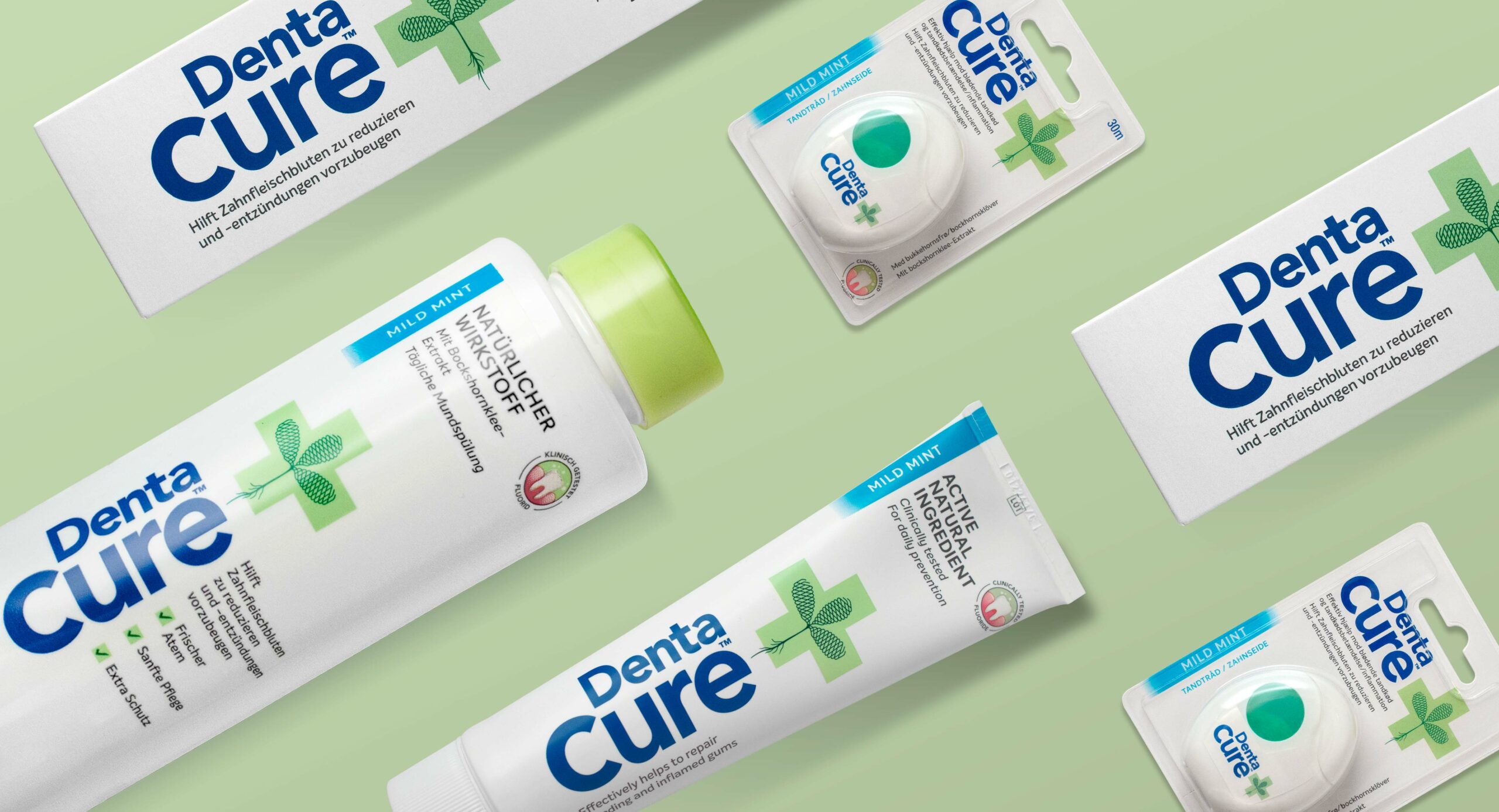
The field of tension between the clinical and high-tech laboratory on the one hand and the naturally effective medicinal plant on the other became the focal point for both the strategic starting point and the development of the brand design. As a result, the conventions for effective and credible oral and dental care products became dominant with a pure and simple white expression and a load-bearing design element connected with the brand name that tells the product’s DNA in one clearly decodable symbol.
The green cross, which is instinctively decoded as ‘pharmacy’ or first aid, meets an optical 3-dimensional precisely drawn fenugreek plant, whose expression is based on a combination of old medicine books and the precision and technology associated with the extraction and manufacturing process of the patented plant extract. Thus, technology and nature are united in one symbol.
During the rebranding process, it was decided to change the product name. Thus the products are now being sold under the name DentaCure. The new design has resulted in a clear identity that creates differentiation on the shelf in the supermarket and gives the consumer a proven natural alternative without the use of chemicals.
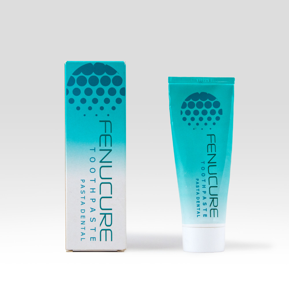
Before 
After
Achieving widespread distribution and listing in retail accounts
“After the redesign, we have seen a nice boost over time in terms of sales. This boost is, of course, also a result of increased marketing and sales activities. However, the rebranding has had a positive effect. DentaCure now looks very attractive, with a good balance and simplicity in the design. The design now expresses the more clinical, medical, and still natural direction we asked for. The combination of rebranding and the new design has contributed to achieving widespread distribution and listing in retail accounts. Before the redesign, we experienced some sort of scepticism among some retail accounts as they did not believe that the Fenucure design seemed attractive, up-to-date, clear and easily decoded, which they definitely think DentaCure is.”
Lars Dyhring Müller, CMO, FenuCure Medical