One Coop – One typeface
Custom typeface for Coop Danmark
These days, many apps and digital presences look alike. They are all clean, white and minimalistic with black logo and black text. This tendency can be a good thing from a user experience point of view, as it makes it easier for us to navigate in apps and websites “we know”. However, as a brand, this trend includes certain challenges; when everyone looks alike, there is no identity – no branding. An increasing part of the daily contact with customers today are on small screens, creating very little space for a brand to express its visual identity. Much of the content on mobile devices is primarily text, making the typography a significant way to unfold the identity.
Project details
The strategic journey towards “One Coop” has made its mark on the development of the new Coop Corporate Visual Identity – especially on the specific part of the toolbox about font. It became clear early on in the process that the optimum for Coop would be to develop its own font. In doing so, Coop would get a font that expresses and support their DNA. Furthermore, a custom typeface would create a red thread between all Coop’s activities across channels and media. Last, but not least, having a custom typeface can not only help creating distinctiveness and recognition for the company, it is also a financial advantage due to expensive license fees.
The new typeface should not only represent the spirit, heritage and identity of this complex organization, but it should also fit several very different business units, ranging from supermarket chains, insurance products and banking to a crowdfunding platform; Coop bank, Brødcooperativet, Superbrugsen and Kvickly, just to mention a few. The task was therefore to create a typeface that holds both the seriousness of banking and the boldness of a good price that could fit on a sign in the middle of the green department in a grocery store.
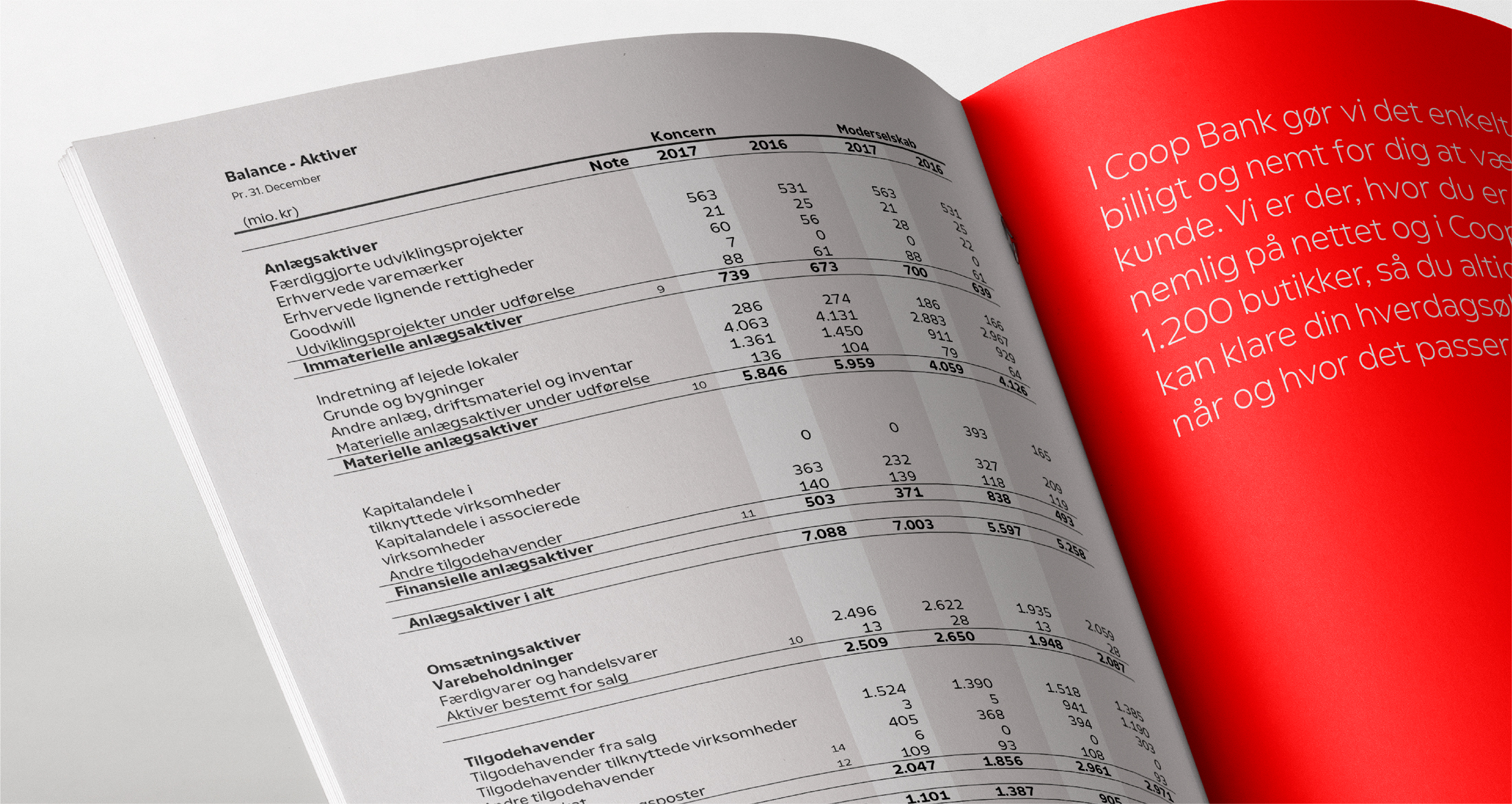
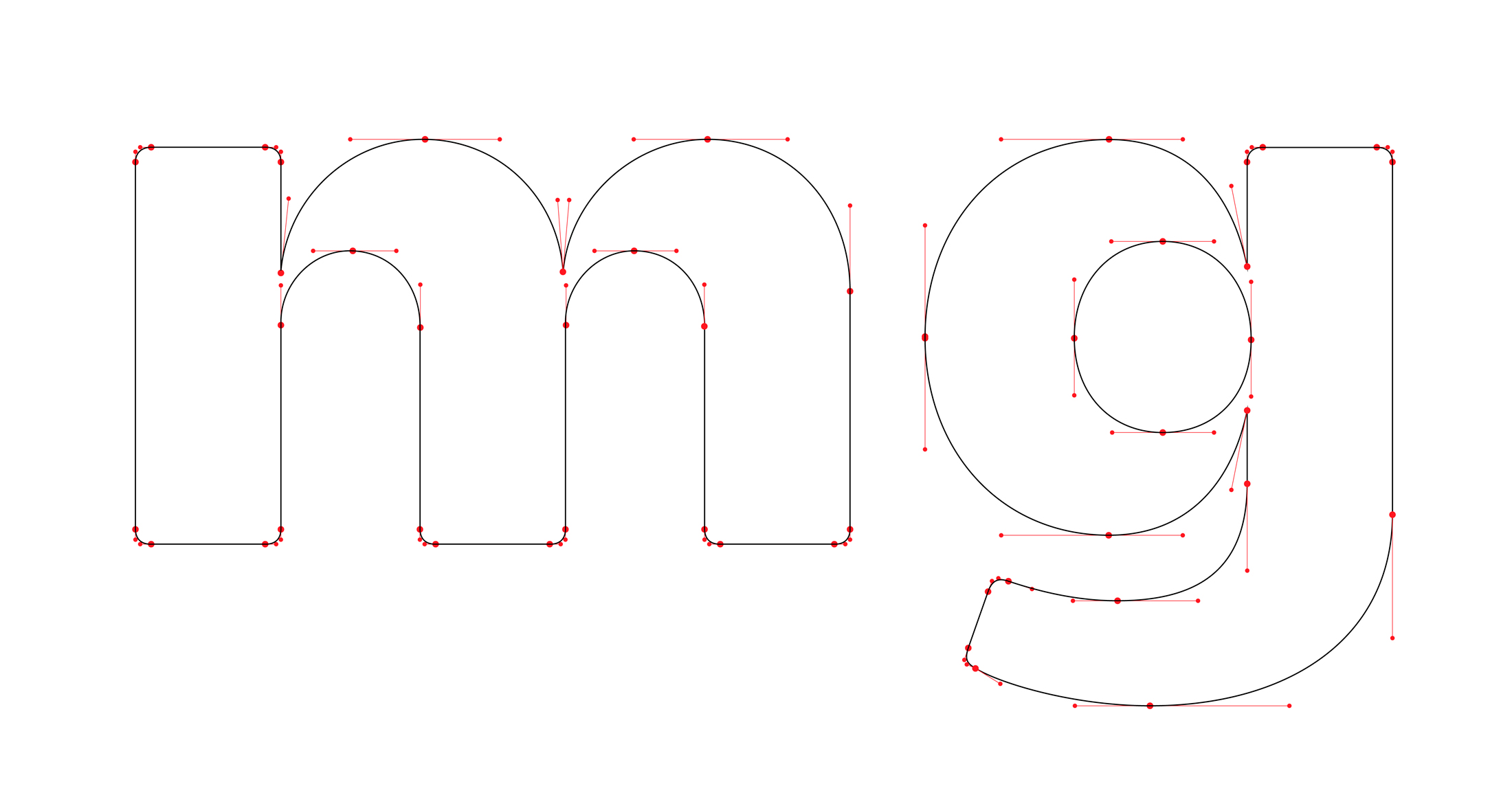
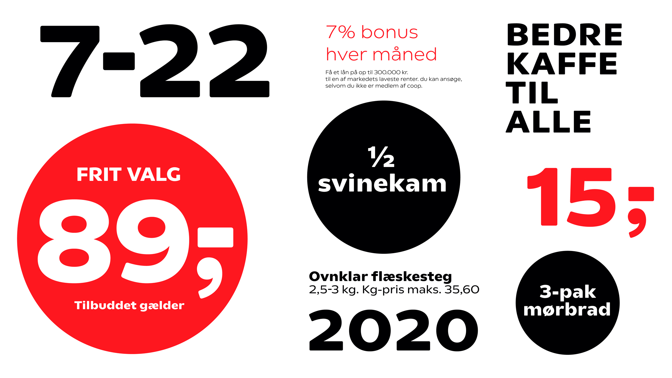
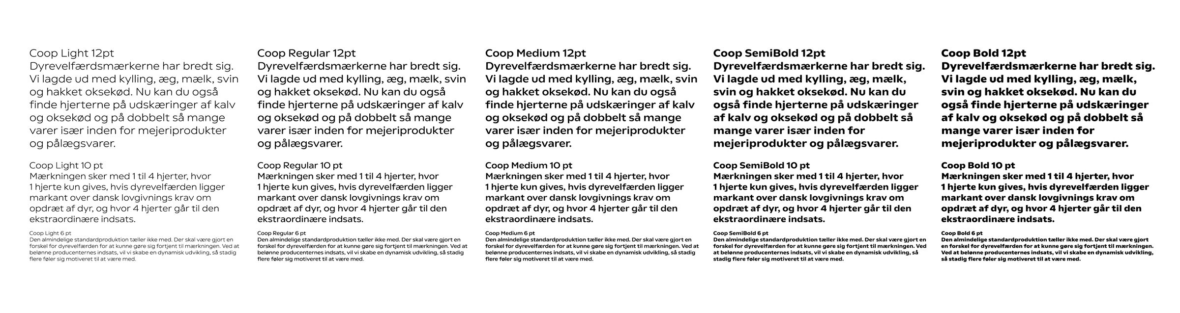
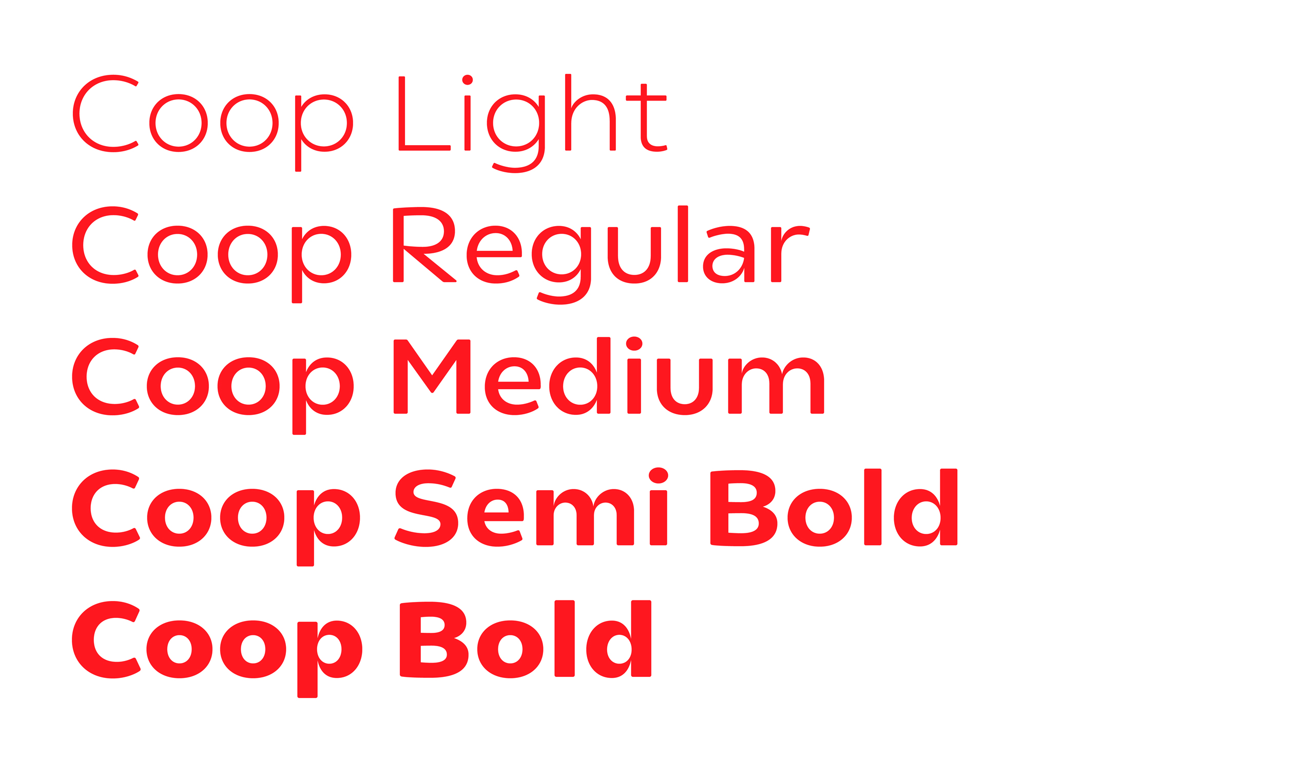
We have designed a new custom typeface for Coop together with type designer Elias Werner. The typeface is a Sans serif in a simple, geometric form creating a clear link to the original and well-known Coop logo. To ensure that the typeface can embrace both promotions in the weekly flyers, signs etc. and financial products – both online and offline – we have developed five weights, focusing on legibility, readability and recognisability. Contrast is increased going from the light to the bold weights, adding character and a sense of friendliness as the typeface gains weight, making the bold weights ideal for signalising strength, openness and empowerment in e.g. promotions, while letting the light weights signalise quality and trust in e.g. financial products and sustainably initiatives.
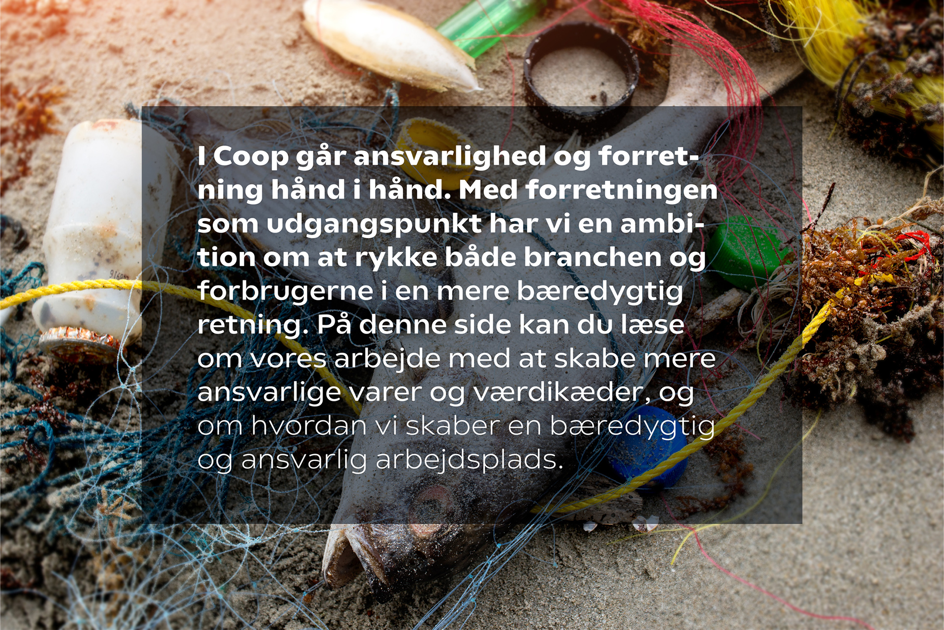

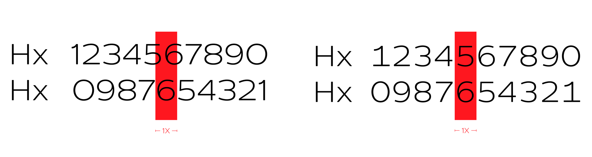
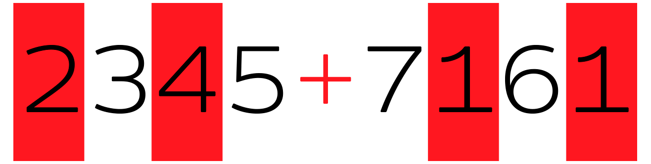
As banking and financial products are a part of Coop’s offerings, numerals are an important aspect of the identity. To ensure better scanning and readability we have designed two spacing formats; tabular and proportional. The figures have been created as a monospaced font, keeping the numbers optically aligned for reports, statistics, banking statements etc.