A new player in a crowded game
Visual identity for Coop 365, Coop Danmark
These days, Coop is rolling out their new supermarket concept, “Coop 365discount”. As the discount stores are moving up in the market with nice stores and wider ranges, and supermarkets are lowering their prices, it could seem challenging to create a new space in a crowded market. However, that is just what Coop has done.

Project description
Coop has never been afraid to test new store concepts, and just a few years back, we assisted Coop in testing two new concepts; “Coop Mad” and “Coop Hverdag”. Building on the experience from these tests, Coop has introduced the “Coop 365” concept. A new green format that places itself between the traditional discount stores and a quality supermarket, with larger stores and a larger number of articles than other discount store concepts.
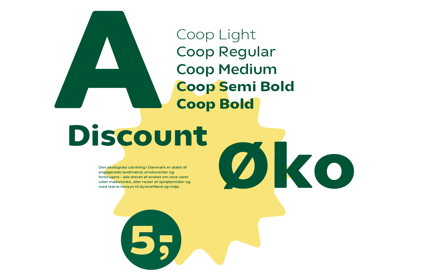
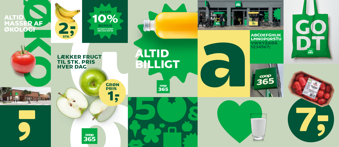
The 365 concept has, since the launch, been adjusted and is now called Coop 365discount. We created the visual identity for the first Coop 365 concept. With the green colour, they wish to send a clear signal of the green focus that Coop 365 will pursue, with a strong focus on organic food and an offering of a 10 %-member bonus on fruits and vegetables.