Removing the gap between the perceived and actual value of the brand
Packaging design for Yarpivo Brewery
During the mid-’00s, Yarpivo faced a stagnating and maturing beer market. Additionally, fierce competition between domestic and international brands hit the market. Displayed on shelves next to brands such as Heineken and Budweiser, the Yarpivo products were suddenly no longer perceived by the consumers as high quality. And even worse, research showed that the Russian consumer considered the quality of the Yarpivo beers as poorer than that of the imported beer brands. Our task was to empower the Yarpivo brand by developing a new design for the range that removed the gap between the brand’s perceived and actual value and quality. Enabling Yarpivo to meet national and international competition in eyesight at the shelf.
Project details
Yarpivo Brewery, founded in 1974, is one of the most technically advanced breweries in Russia. The brewery produces high quality beverages, several of which have been internationally awarded. The brewery’s main brand, Yarpivo, is the 2nd largest Russian beer brand in the market.
During the mid ’00s, the brewery faced a stagnating, maturing beer-market and, as a result thereof, an even more fierce competition between domestic and international brands. Displayed on shelves next to brands such as Heineken and Budweiser the Yarpivo products were suddenly no longer perceived by the consumers as possessing the high quality they actually had – and even worse, research showed that the Russian consumer considered the quality of the Yarpivo beers as poorer than that of the imported beer brands.
Thus, the task was to empower the Yarpivo brand by developing a new design for the range that removed the gap between the perceived and actual value and quality of the brand. Enabling Yarpivo to meet national and international competition in eyesight at shelf.
Although it would have been easy to dress Yarpivo up in borrowed plumes to make it look more like its international competitors, it would have meant a betrayal of the history, heritage and pedigree of the Yarpivo brand.
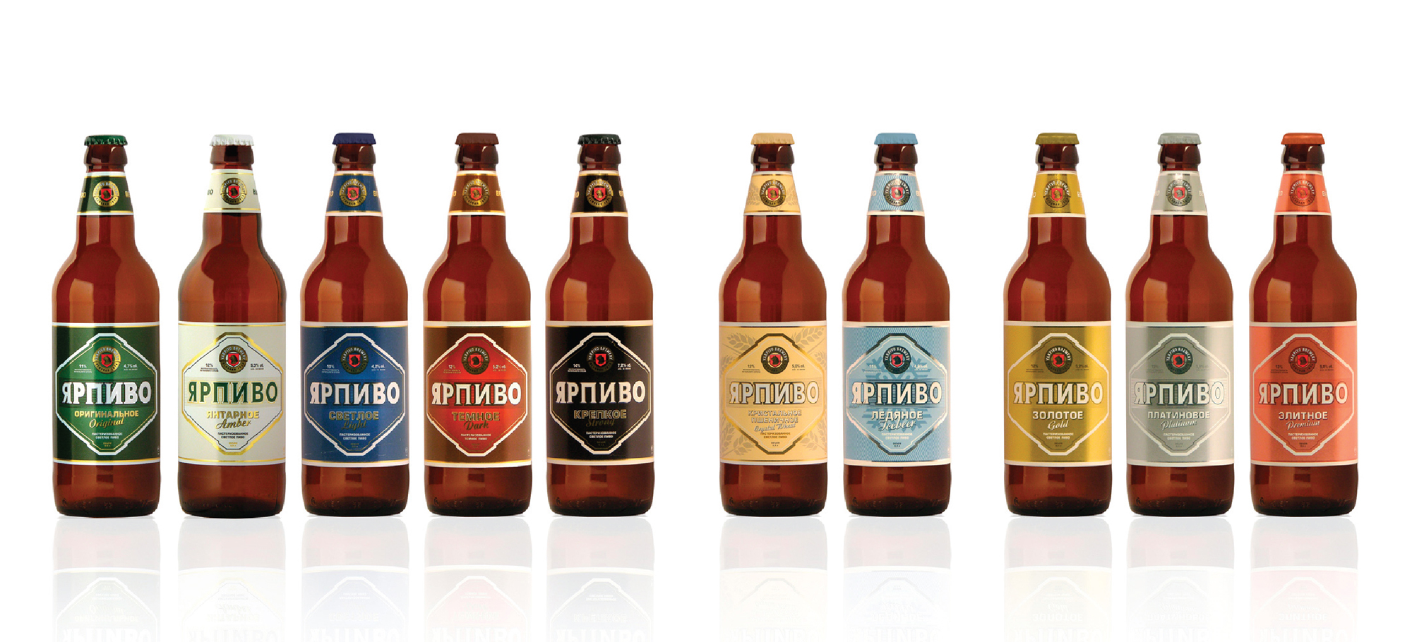
Consequently, the new design was created with the purpose of maintaining the Russian origin and emphasising the strong, recognisable graphic elements of the previous design; the diamond shaped square and the Yarpivo brand.
The colour code system used to distinguish between the different beers was redefined, and the new colour palette was found among the traditional and characteristic Russian colours known from the Russian Orthodox Church.
The front label was enlarged in order to create a more spacious and calmer look, just as the product information was prioritised and placed accordingly on the 3 different labels; front, neck and back.
Finally, the traditional bottle was substituted with anew, taller and more modern bottle featuring stronger shoulders and a long, slim neck.