An iconic and clear design
P20 & Perspirex, RIEMANN
With a shared sense of details and high design aesthetics IDna Group and Riemann began the design development – ending up with a deliberate iconic and clear design for both product lines.
Project details
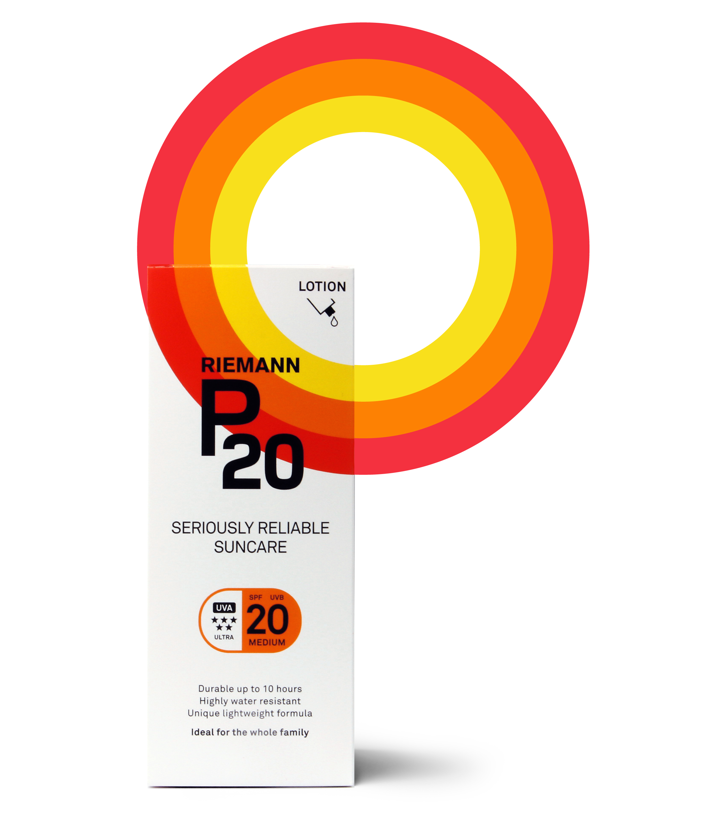
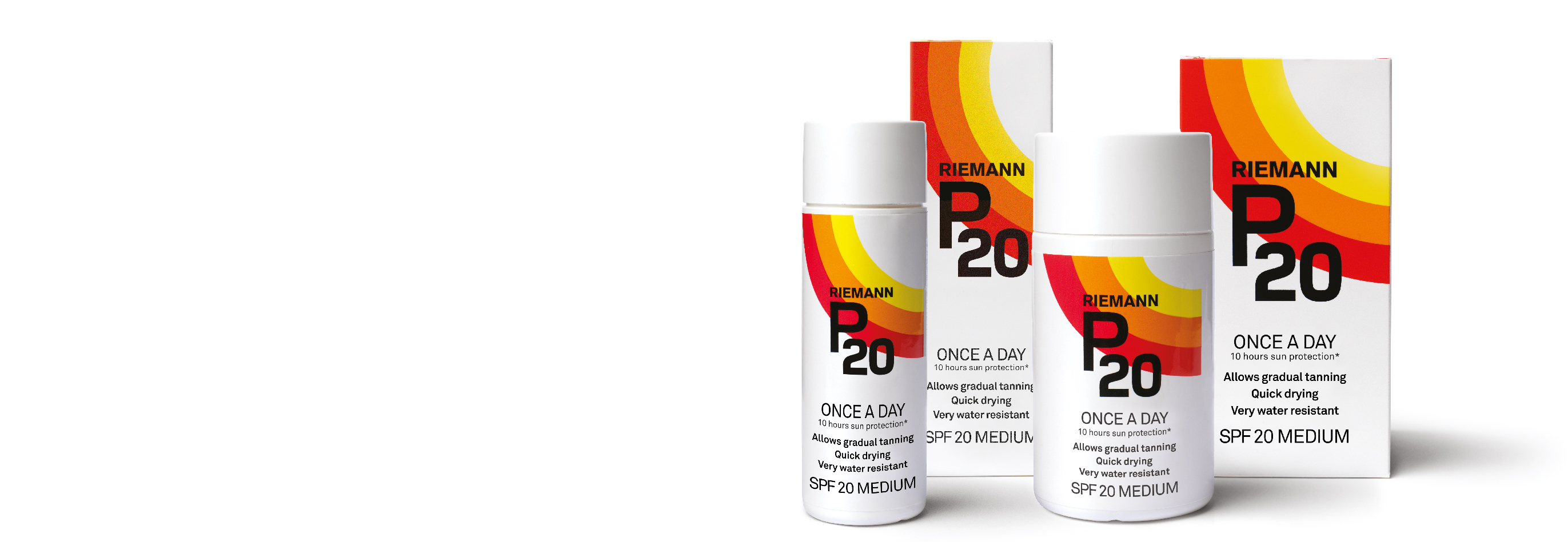
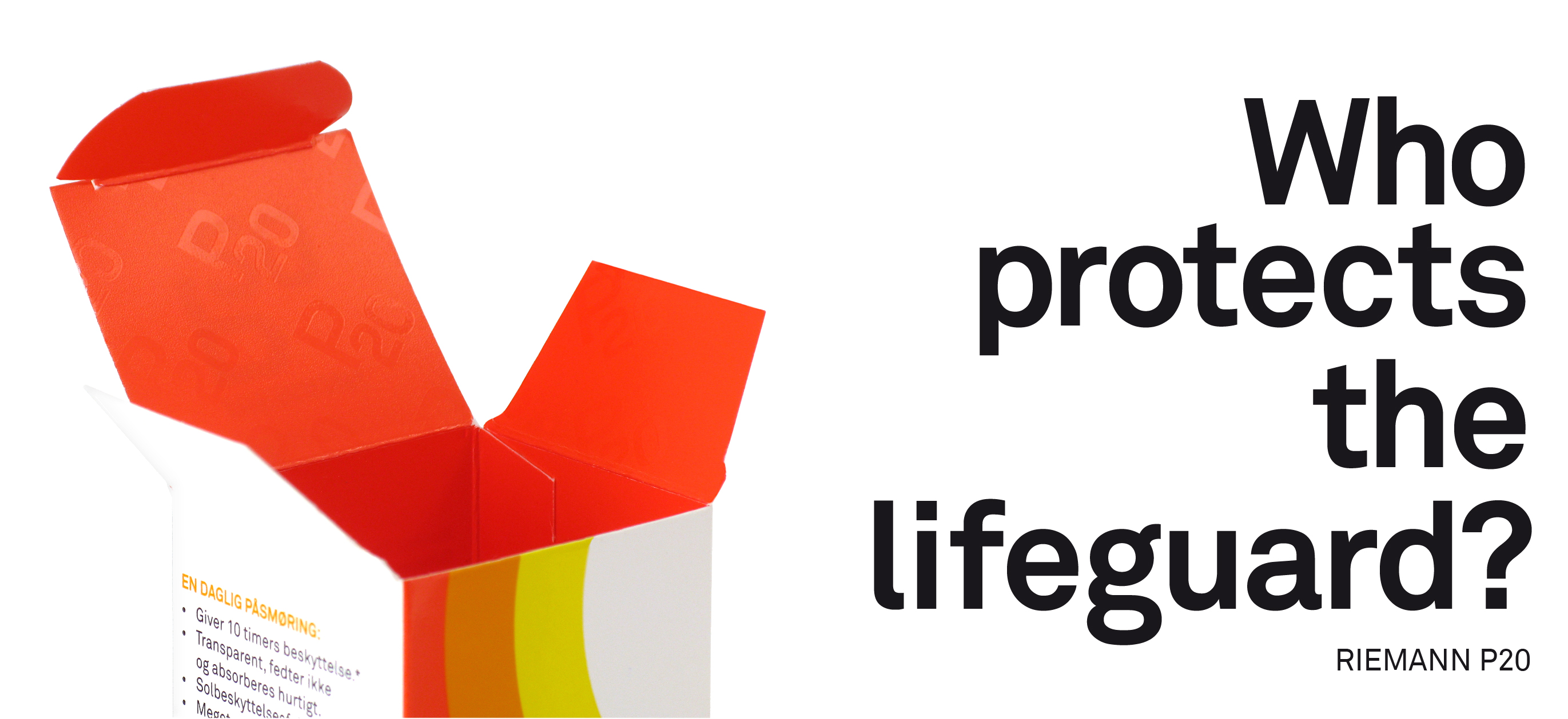
Riemann is a Danish manufacturer of best-in-class skin care products. We were asked to redesign the Riemann P10/P20 sun protection packaging with respect to its heritage. The redesign of the Perspirex antiperspirant packaging followed the redesign of the P10/P20 products.
With a shared sense of details and high design aesthetics IDna Group and Riemann began the design development – ending up with a deliberate iconic and clear design for both product lines.
The original P10/P20 design was designed back in the 1980s, and the retro style has survived and stayed cool for nearly 30 years. The redesign thus focused more on emphasising the product identity, giving the packaging an even stronger visual stand-out effect.
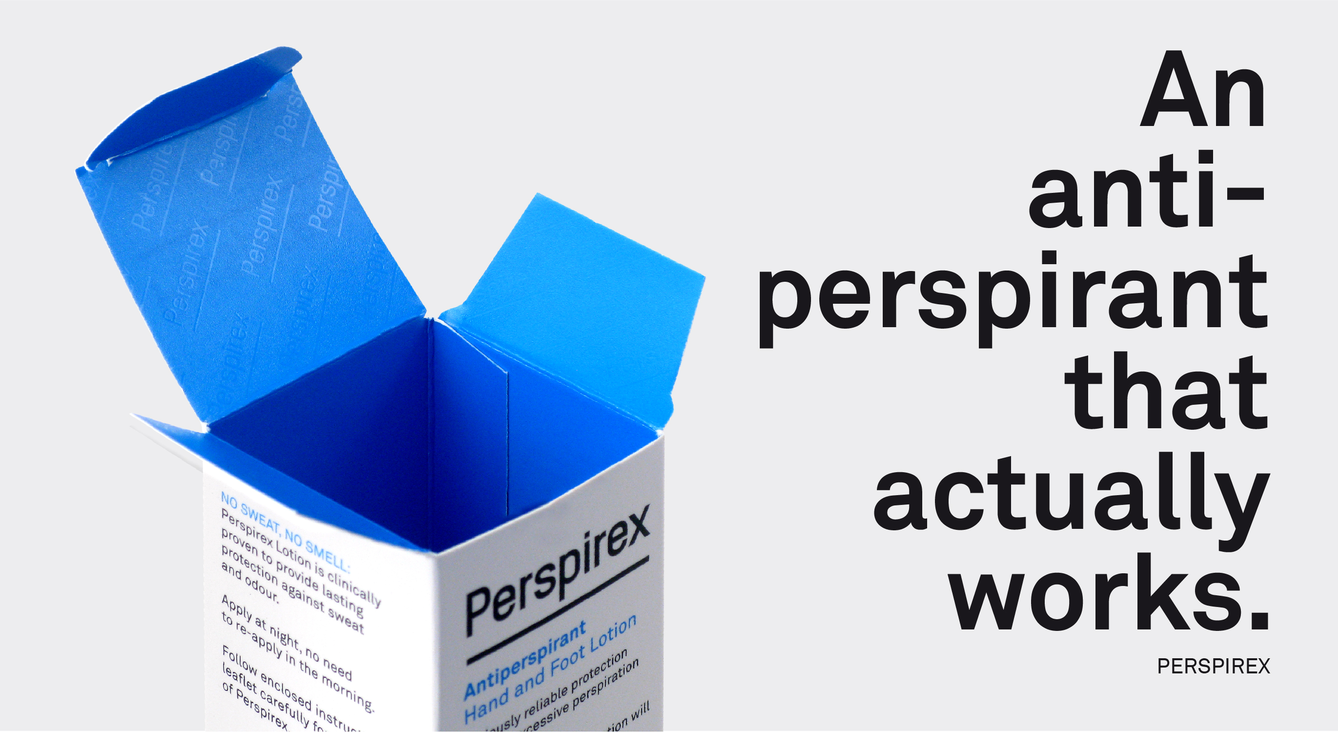
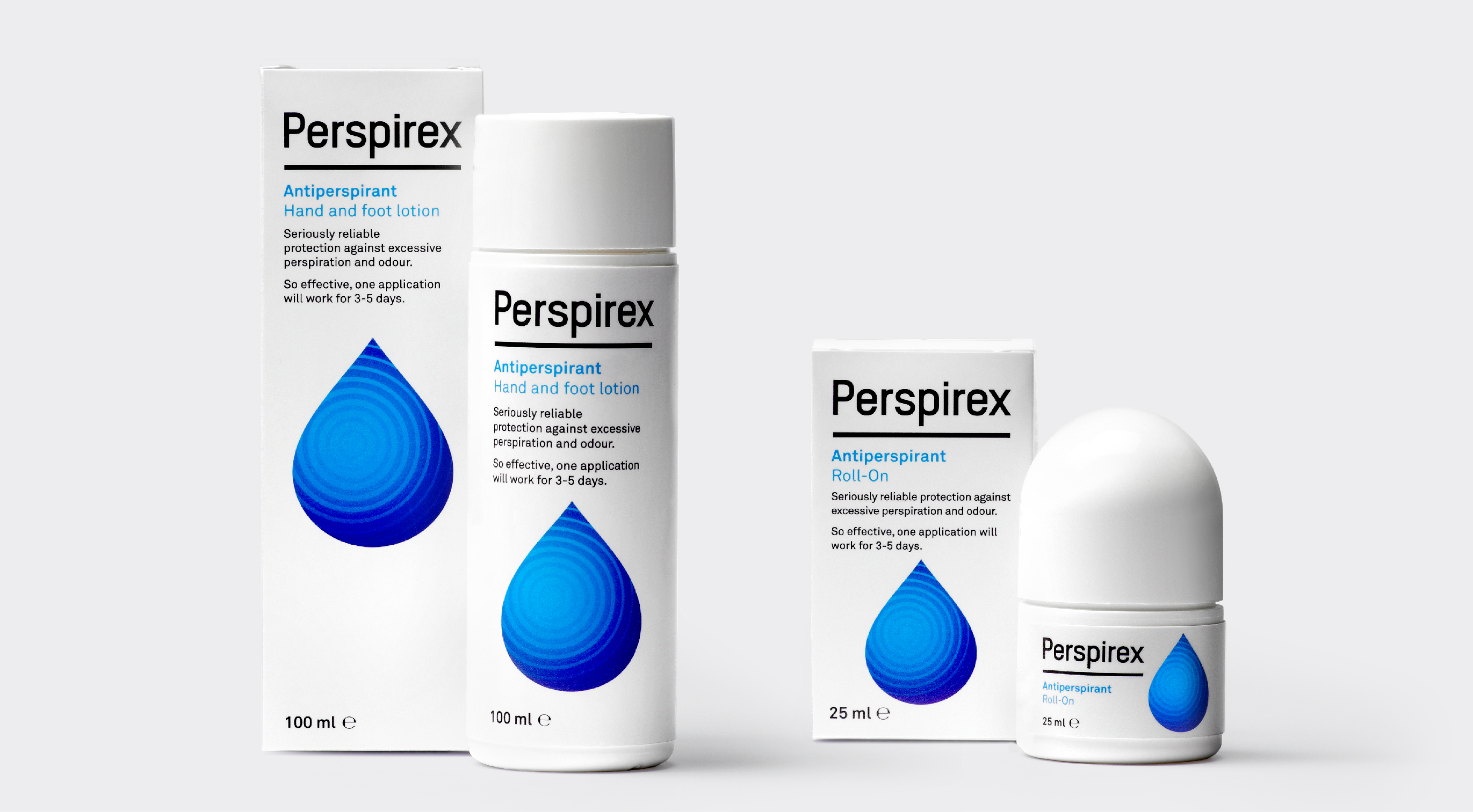
The Perspirex design expresses the actual core benefit of the product – the long-term protection from perspiration and odour without discomfort. The blue drop on the white packaging generates a clear and clean visual identity, making it stand out on the shelf among very busy competitor designs.


The Perspirex design expresses the actual core benefit of the product – the long-term protection from perspiration and odour without discomfort. The blue drop on the white packaging generates a clear and clean visual identity, making it stand out on the shelf among very busy competitor designs.