
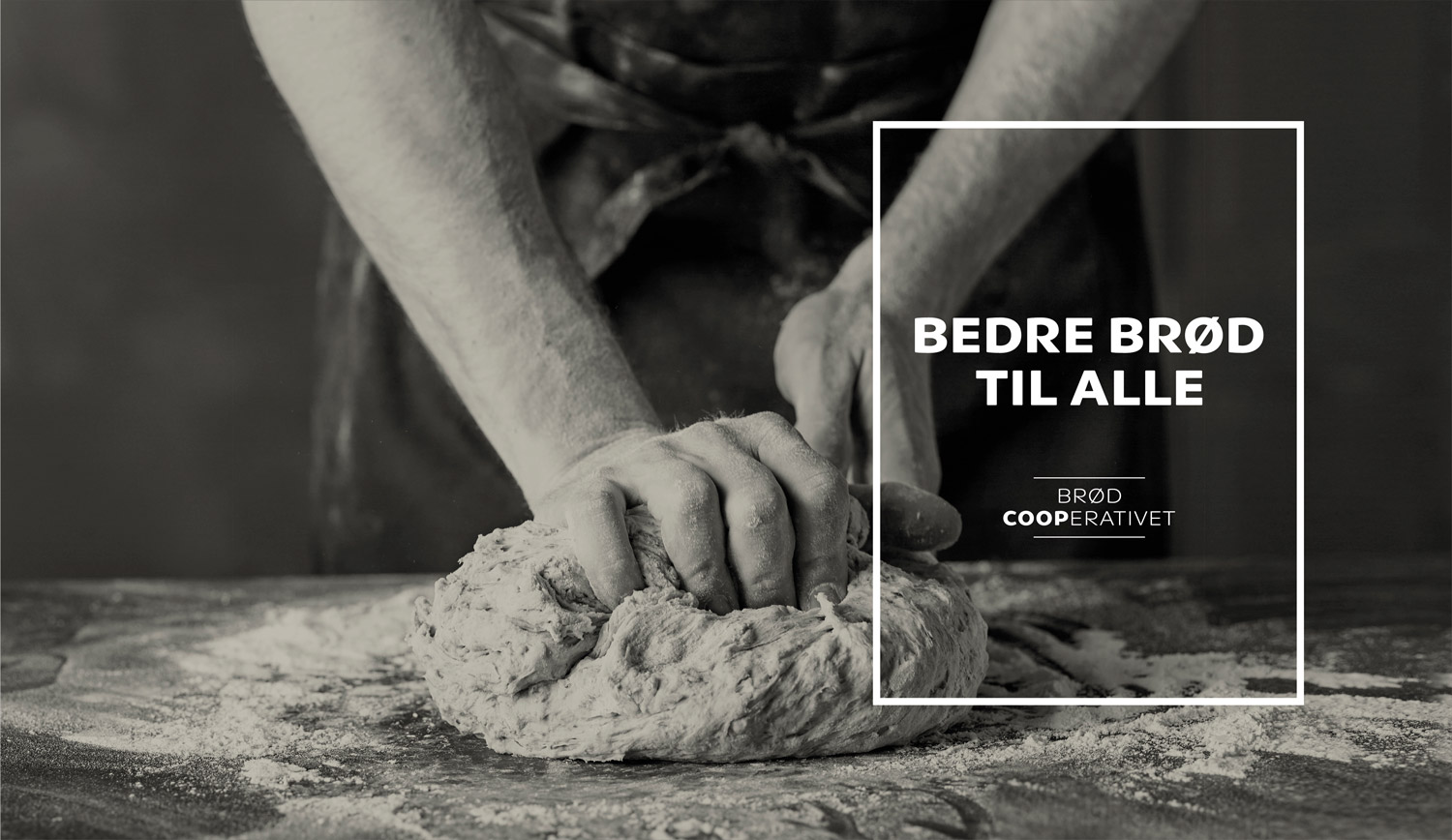
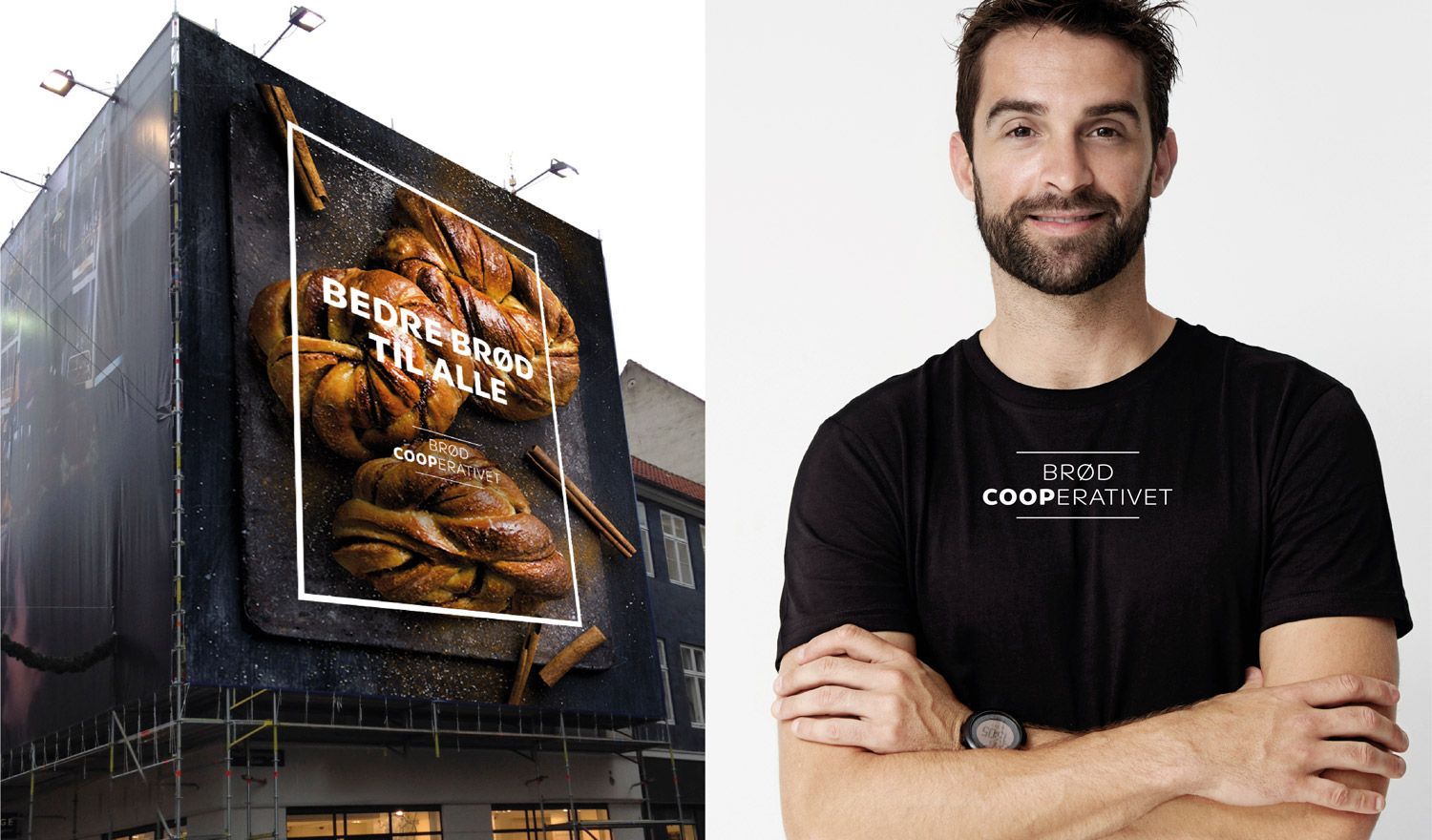
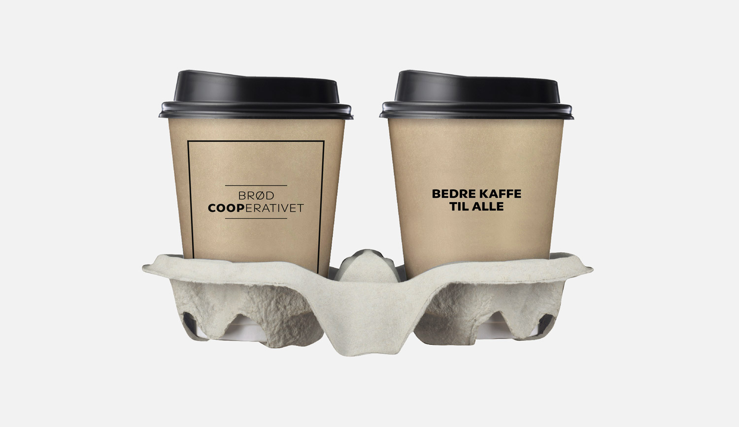
Premium quality bread democratized
Brand design & packaging for BrødCooperativet (Coop Denmark)
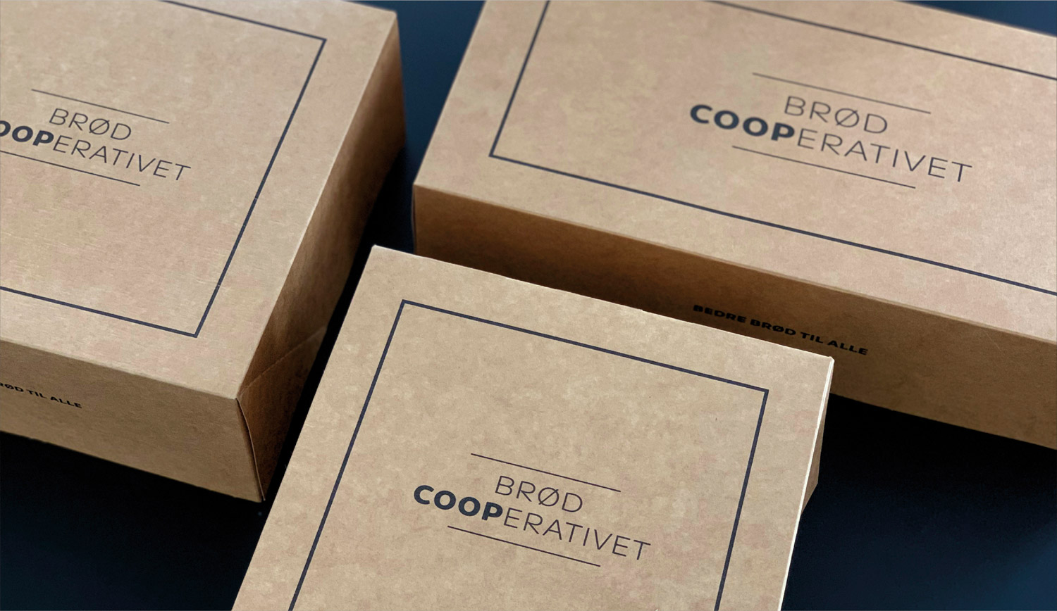
In response to the fierce competition in the grocery sector in Denmark, Coop has launched a number of initiatives over the last couple of years. Focus has to a large extent been on convenience and high quality, and BrødCooperativet was one of these initiatives making good bread accessible to all. We have redesigned the brand identity to ensure that it is coherent with Coop’s corporate visual identity and at the same time has the necessary flexibility to be easily adaptable to Coop’s various grocery chains reaching from hypermarkets to small local supermarkets.
Project details
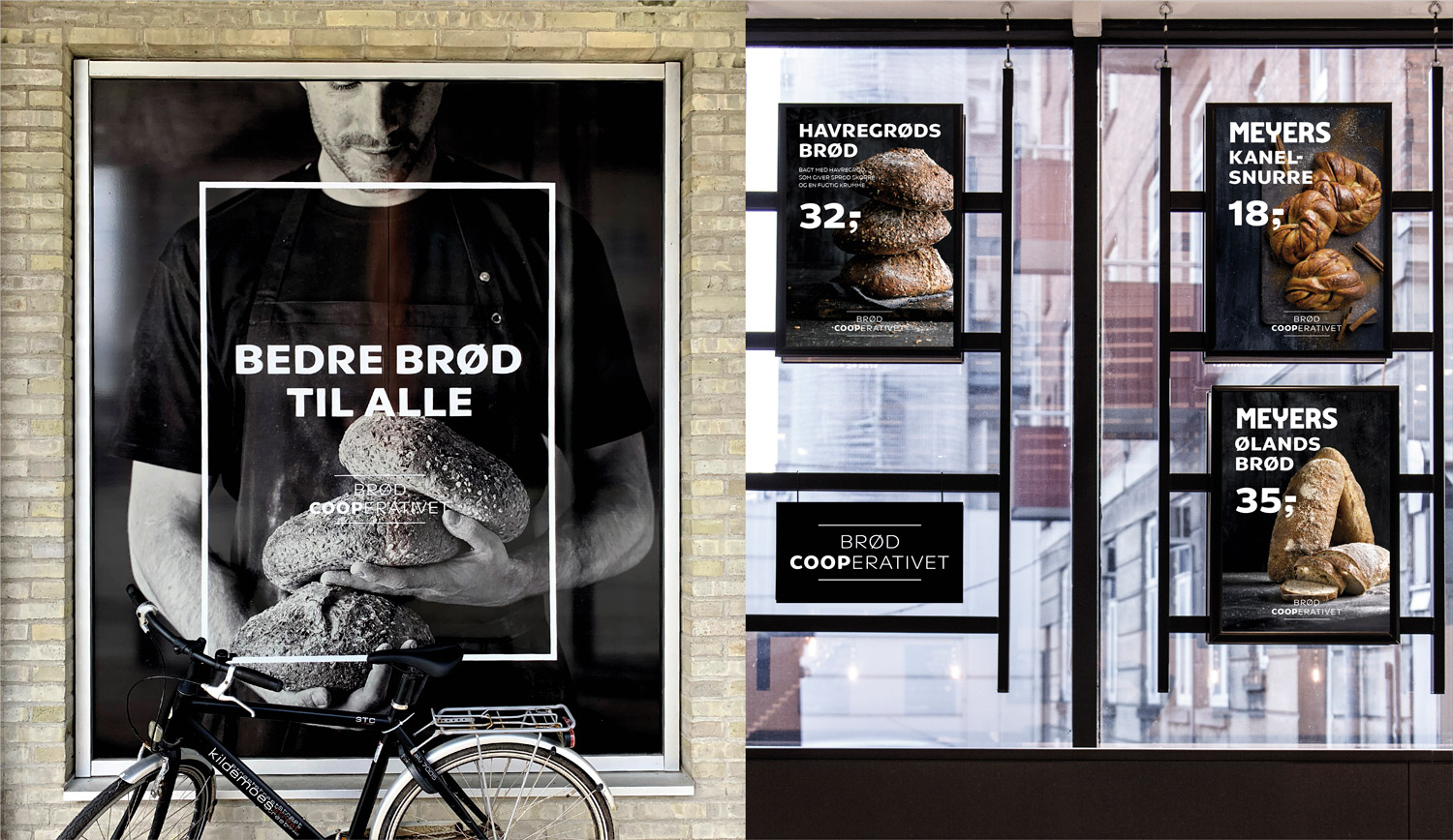
Coop Danmark is the leading consumer goods retailer in Denmark, operating the retail chains Kvickly, SuperBrugsen, Dagli’Brugsen, Coop.dk Shopping, Coop.dk MAD and the subsidiaries Fakta and Irma. Due to the vast number of chains, the identity for BrødCooperativet had to be flexible enough to allow the concept to unfold in different sizes, ranging from local rural supermarkets to large hypermarkets, while ensuring a clear link to Coop’s corporate identity.
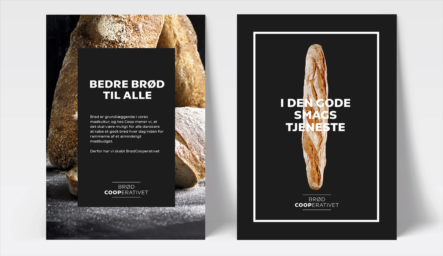
BrødCooperativet was developed to give everyone access to high quality bread and cakes. – An initiative that goes hand in hand with Coop’s vision “together for better food” (Sammen om bedre mad) and their overall DNA showing responsibility and leadership in order to ensure easy access to better choices for everyone.
The new concept is currently on the roll-out in supermarkets around Denmark and is already implemented in most Kvickly hypermarkets and most SuperBrugsen supermarkets resulting in BrødCooperativet currently being Denmark’s largest bakery chain.
Contact
Related work
Coop 365 visual identity
We have created the visual identity for the Coop 365 concept. With the green colour, they wish to send a clear signal of the green focus that Coop 365 will pursue.
Coop Visual Identity
Creating a new identity system for Coop Identity system and visual identity for Coop Danmark Coop Denmark has for years…
Irma packaging design
In 2018, the Danish high-end Supermarket Irma got a new strategy; “The Urban Irma”, and as a result we updated their visual identity to fully support the new positioning. In continuation hereof, we have created a new packaging design for Irma’s two own labels “Irma’s” and “Irma’s hverdag”.
Irma
In 2018, the Danish grocery brand Irma presented their new business strategy. Based on the new strategy, we were assigned to develop a new positioning for Irma and furthermore, to update Irma’s visual identity, in order for the visual expression to support the new positioning and strategic direction.