
A reflection of Willumsen’s spirit
Strategy and visual identity for Willumsen’s Museum
Following the strategy-work we did for Willumsen’s Museum, we have created a new visual identity for the museum. An identity that holds more than just the artist himself – but now to a greater extent, holds his spirit, supporting J. F. Willumsen in being eternally relevant.

Project details
One of the challenges that the museum experienced was the fact that they are a single-artist museum. For some, this can be an advantage. But being located one hour’s drive from Copenhagen and with Willumsen not being one of our most well-known artists, in spite of him being recognised as a world-class artist, is a challenge for the museum. One of the solutions that the museum suggested was to change the approach from primarily being about Willumsen’s own works to allowing other artists to exist and interact side-by-side with Willumsen – presented in his spirit. In other words, all works, and all exhibitions, will now always be presented as a reflection of Willumsen’s thinking, approach and spirit.
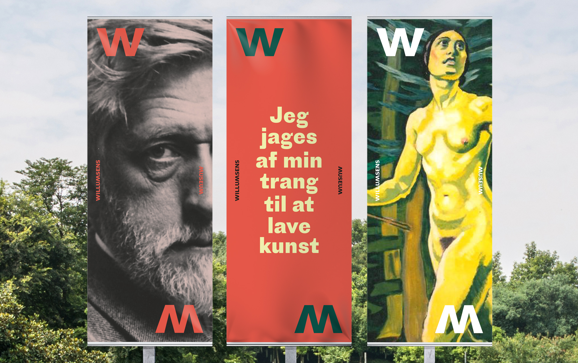
This new approach to Willumsen’s works inspired us to create the underlying concept in the new visual identity; A reflection. The reflection is a metaphor of what role the museum has now, being introducing the spirit of Willumsen – not only to the visitors at the museum in Frederikssund but also to the world. This reflection, or mirroring, is now seen in the logo, where the W for Willumsen is reflected as an M for Museum. This reflection is also used in the new imagery, for instance, where Willumsen’s portrait or his art is “morphed” together with other artists’ works to make Willumsen present at all times.
The primary colours of the identity are black and white. However, to make J. F. Willumsen visibly present at all times at the museum, the secondary colours in the visual identity derive from his own works. We have carefully selected a number of his most important works and have extracted colours from there. The colours can only be used in the same compositions as in these works, creating a wild and vivid palette for further communication.
Despite the decision to create room for other artists, or perhaps as a result thereof, we experienced a need to give J. F. Willumsen a more visible role in the communication and the new visual identity. Therefore, we have used a number of his quotes and portraits to make him ever-present throughout the new visual identity.
Willumsen is alive.


Colours
The primary colours of the identity are black and white. However, in order to make J. F. Willumsen visibly present at all times at the museum, the secondary colours in the visual identity derive from his own works. We have carefully selected a number of his most important works and have extracted colours from there. Colours that can only be used in the same compositions as in these works, creating a wild and vivid palette for further communication.


Concept
The reflection is a metaphor of what role the museum has now, being introducing the spirit of Willumsen – not only to the visitors at the museum in Frederikssund, but also for the world. This reflection, or mirroring, is also used in the new imagery, for instance where Willumsen’s portrait or his art is “morphed” together with other artists’ works to make Willumsen present at all times.


