
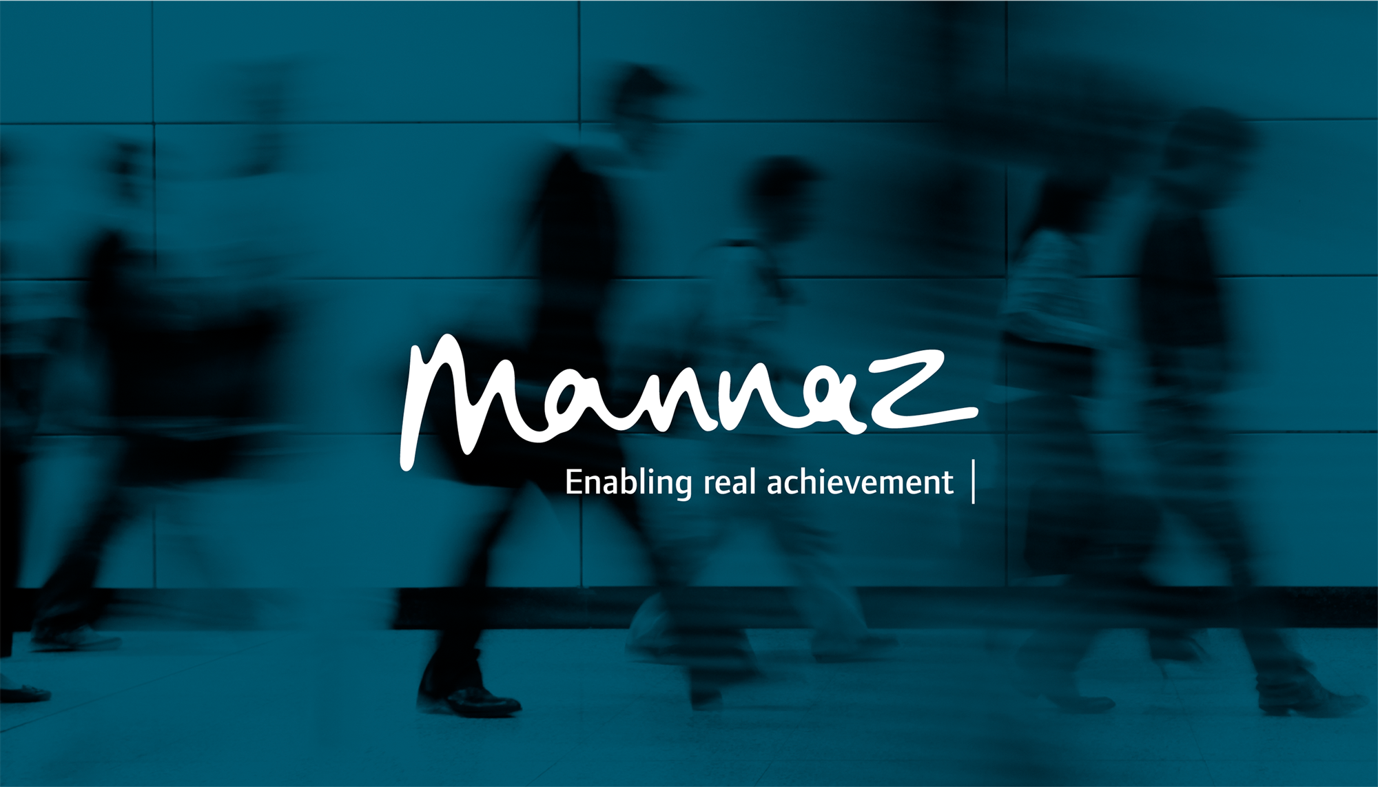
Enabling real achievement
Naming and visual identity for Mannaz
The competence development company DIEU had existed for more than thirty years, during which the company worked on creating international growth. This led to an establishment of offices in Brussels, London and Berlin. Following the internationalisation of the company the name ”DIEU” created a number of challenges, one of which was that ”DIEU” means ”God” in French.
Project details
We were giving the task to develop a new company name and subsequently a new visual identity. DIEU wished for the new name and the new visual identity to reflect the company’s Scandinavian roots and long history.
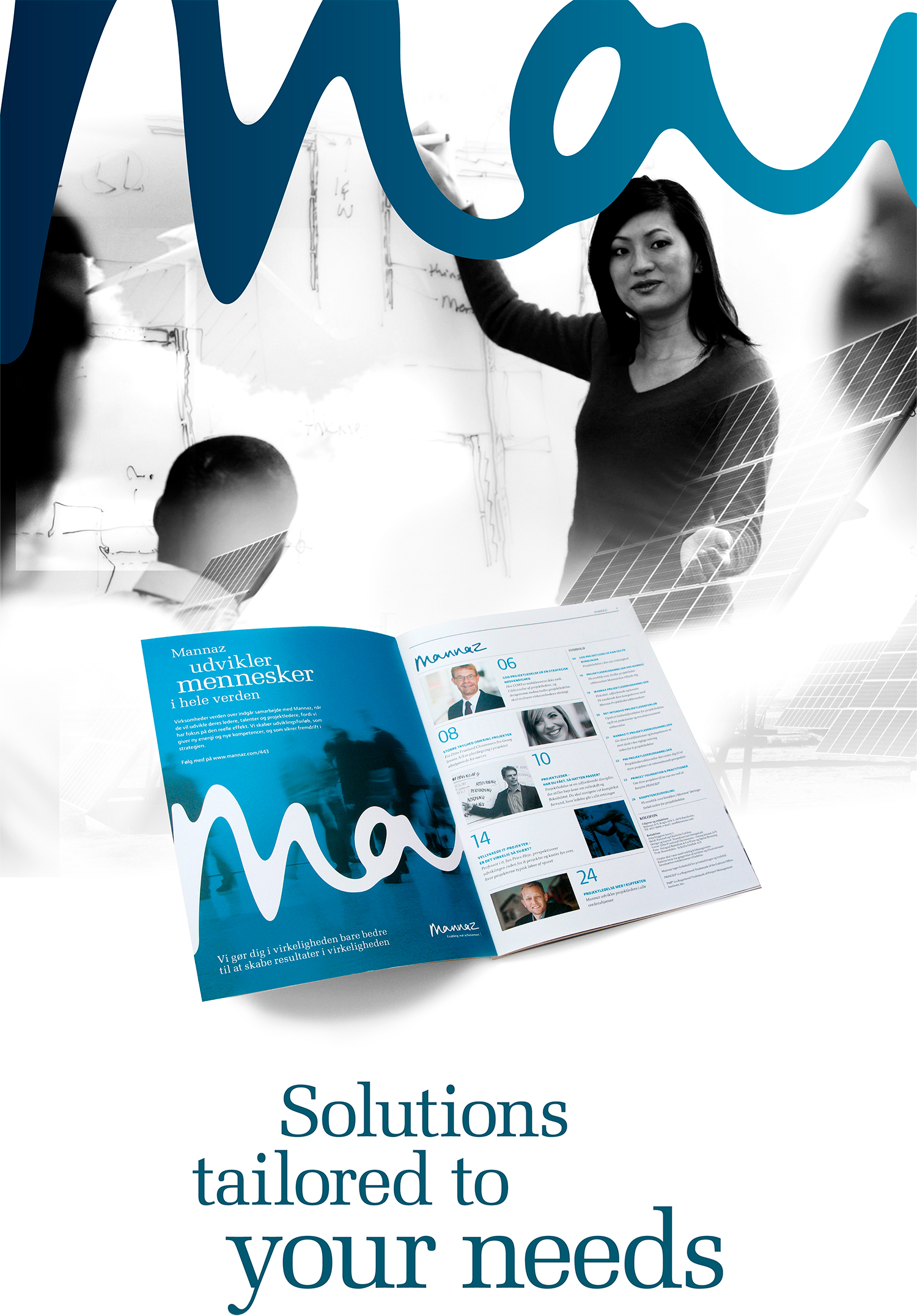
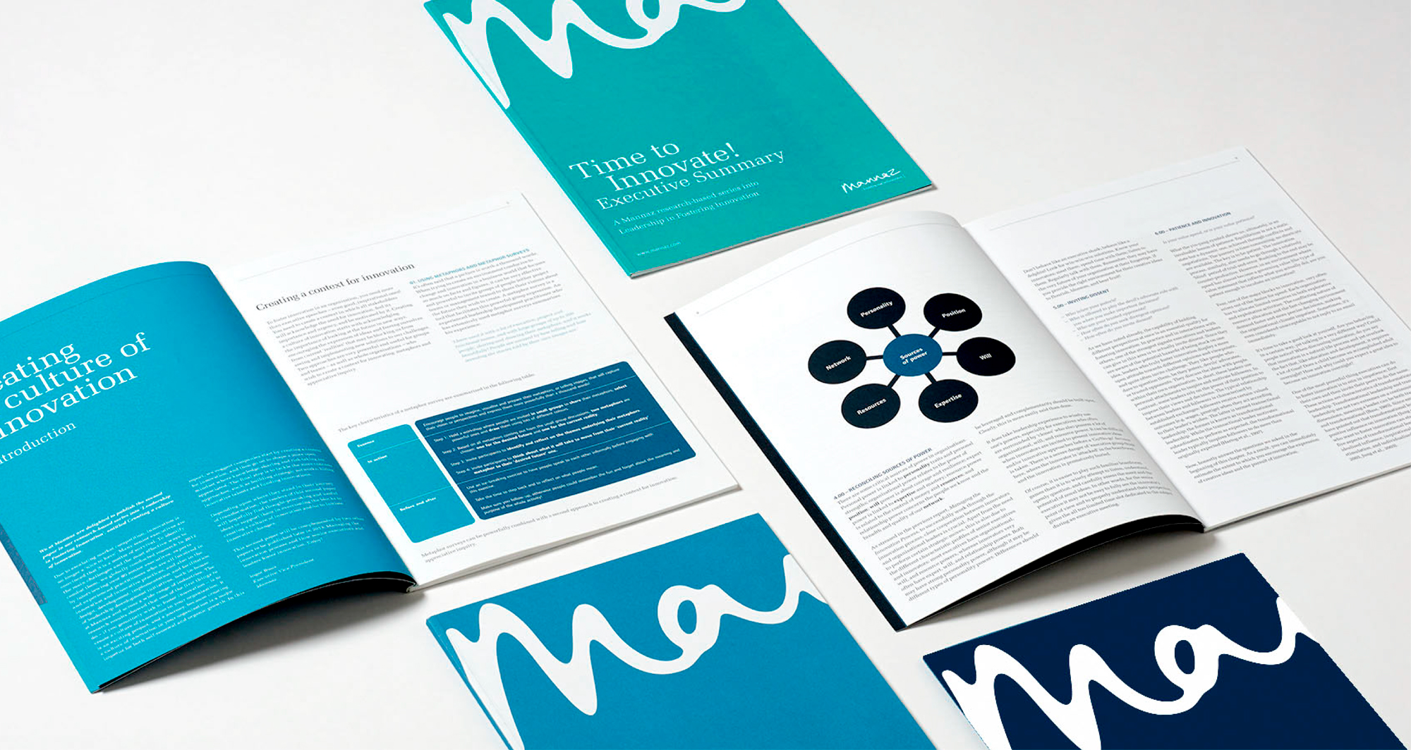
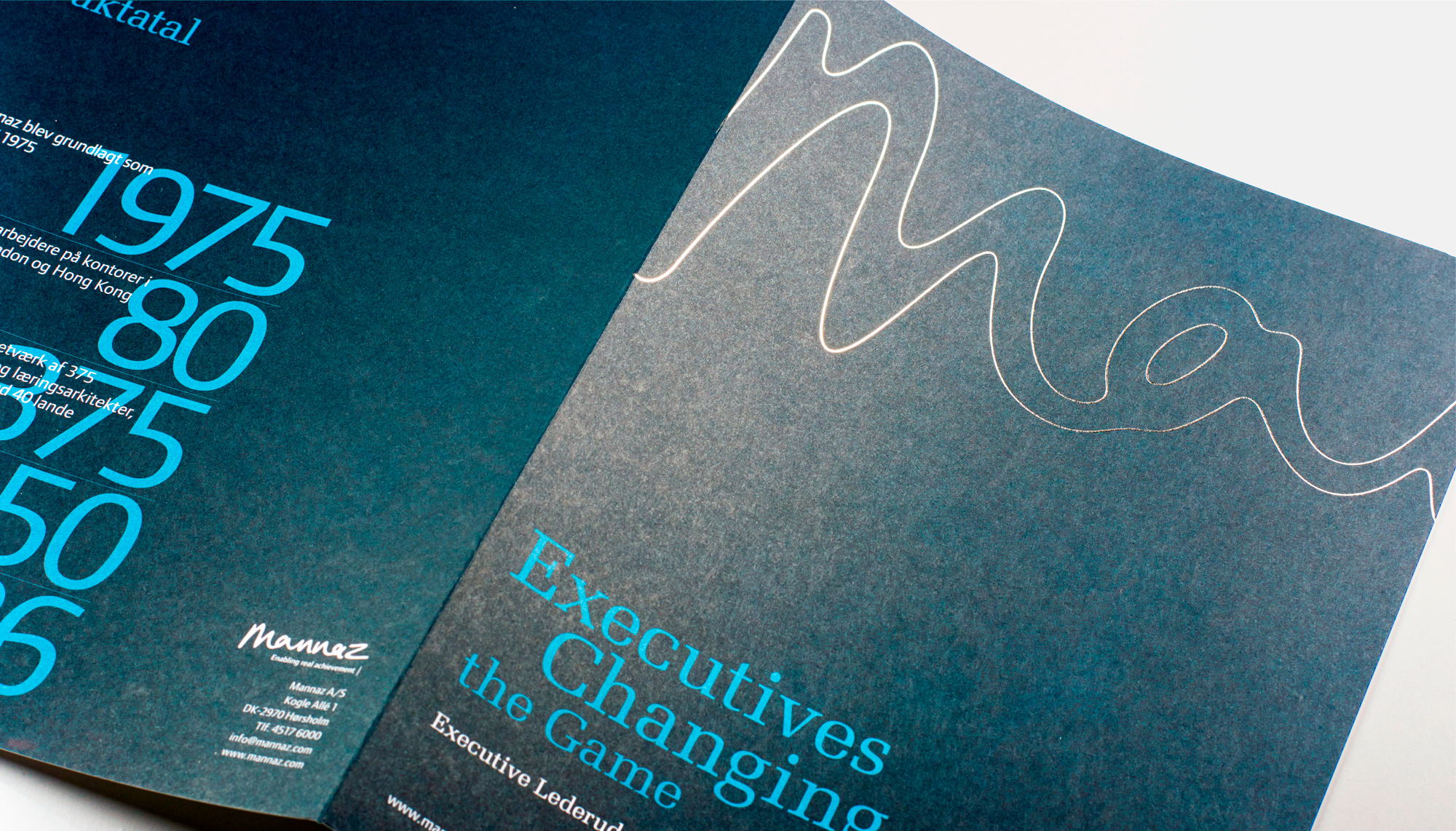
Mannaz is Proto-Germanic and means human. The logo is handwritten, which in itself carries the reference to the focal point of the company – the unique human being. The logo contains both soft and hard values due to the combination of the organic form and the cool, blue colours. It is the underlying basis of the entire identity, and an inherent, recurrent visual element in the form of the graphical structure. The style of the photos and the colour palette supports and expresses the Scandinavian roots.

Contact
Related work
IFPA – Rebranding
Together with IFPA, we conducted a repositioning and rebranding process, activating the inherent identity of the federation for securing their impact against psoriatic disease in the next era.
Dora Nordic – Visual identity
DORA is an anagram of the word road, and it is the promising start-up that rethinks the allocation of goods in freight vehicles. We helped with strategic consultancy and developed their new visual identity.
Byggesocietetet – visual identity
The new visual identity for Byggesocietetet embraces both the traditions and the future that the organization faces while rejuvenating the perception of the industry to attract a younger target group.
econic – Visual identity
The two Dutch companies FCTR E and Zon, joined forces to create an e-home company that will accelerate the transition towards more sustainable heating and energy consumption in European homes. We have created a new visual identity for the new company, econic.