VisitDenmark
Brand strategy, brand identity and visual identity for VisitDenmark
Our task was to redesign the visual identity for Denmark and VisitDenmark, which was created in 2003 and further developed in 2007. The objective of the original redesign was to create a distinct separation between the national tourist organisation, VisitDenmark, and the product Denmark.

Project details
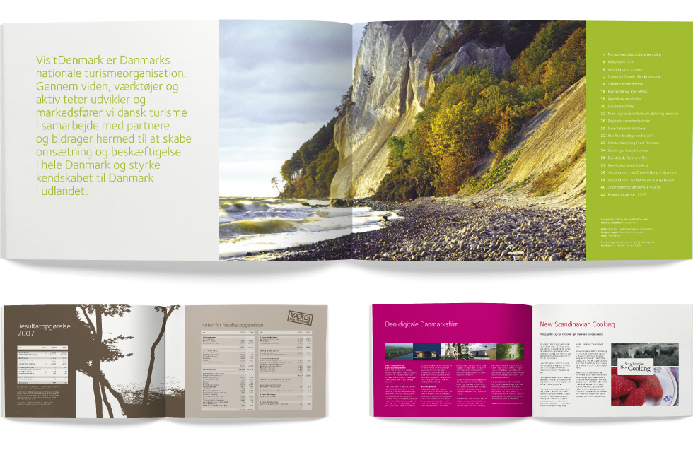
In the process, a brand new design program was developed for VisitDenmark to create a clear and uniform graphic line in the communication of VisitDenmark and support the messages in VisitDenmark’s internal values. Through this, the goal was to contribute to the surrounding world’s perception of VisitDenmark as a dynamic, responsible and goal-oriented partner.
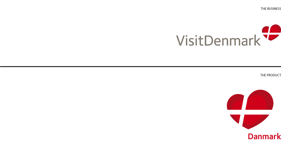
In 2007, the identity was revised once more with the primary objective of adding more graphic tools. The new logo is the focal point of a clear, unique and modern identity. The logo is written in a warm grey, with small letters on a light background, creating an accommodating and corporate look.
The new dynamic and spacious heart-shaped symbol capture both the essence of the organisation, VisitDenmark and the product, Denmark, in the combination of rational (the flag) and the emotional (the heart), thus becoming the bridge-builder between the two.
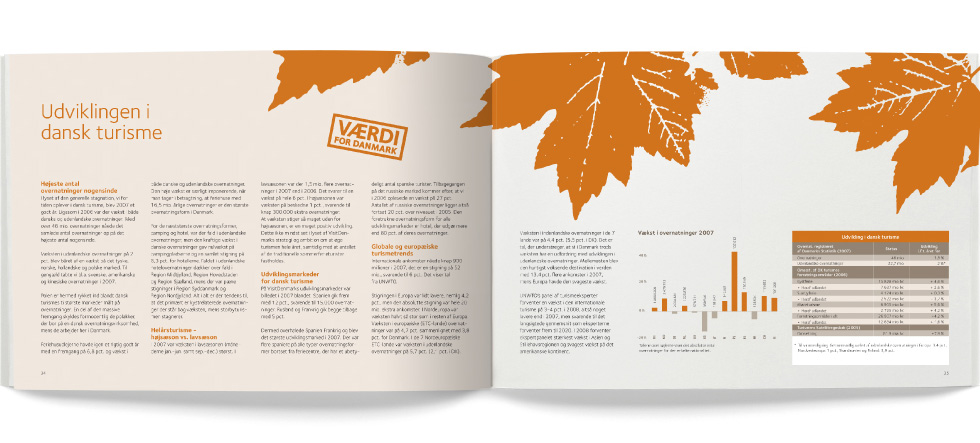
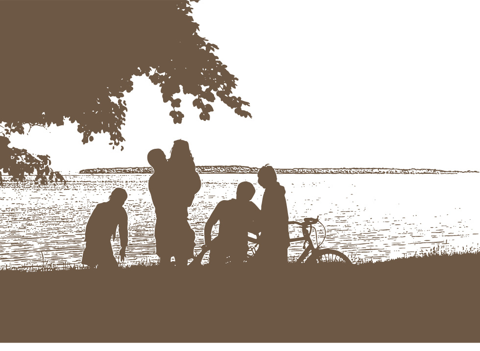
The revision in 2007 included, among other things, an additional colour palette, along with a series of photo-graphical elements.
