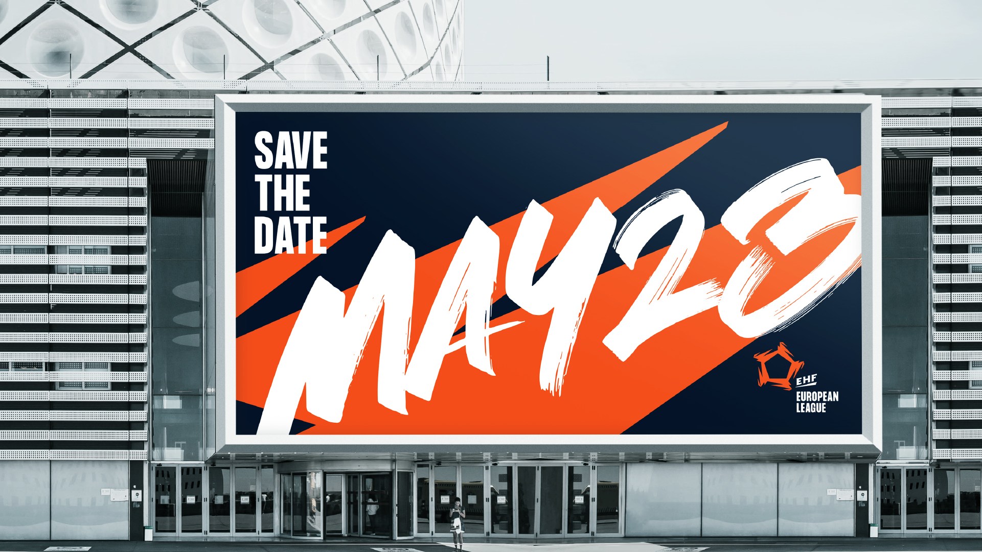
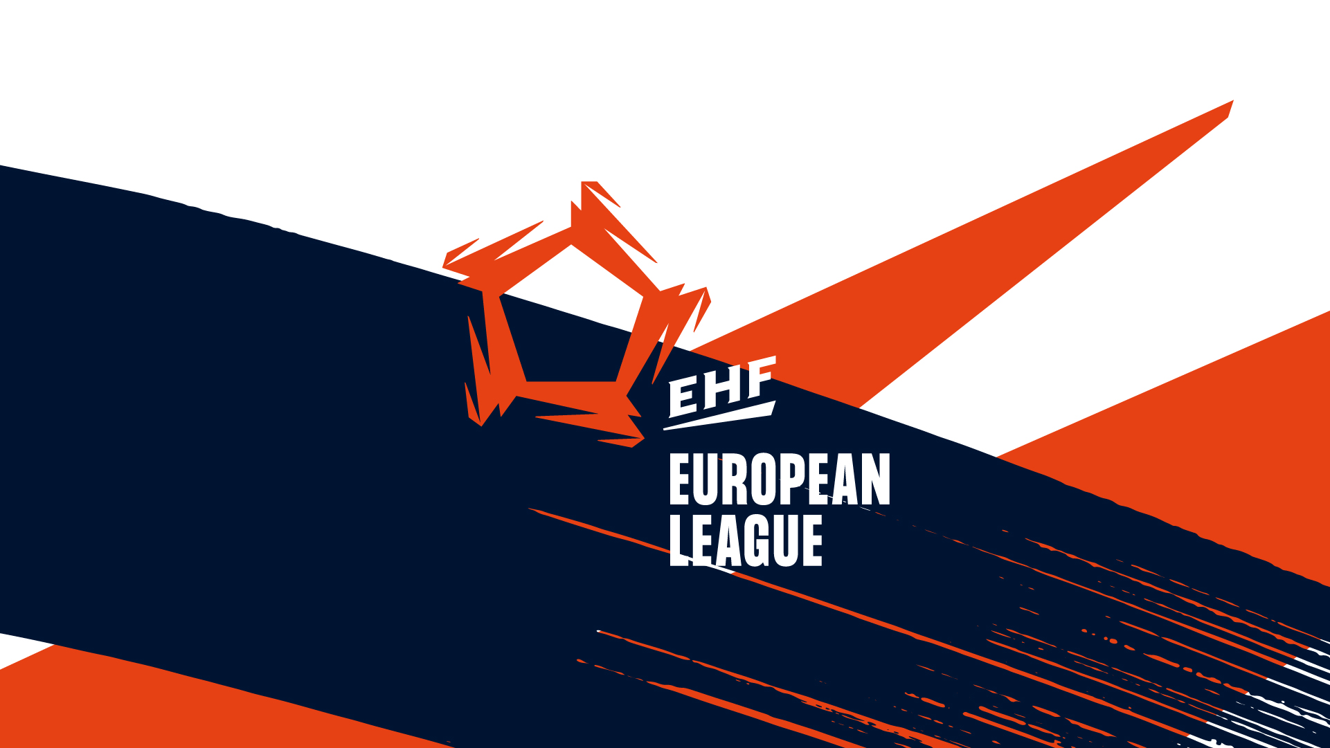
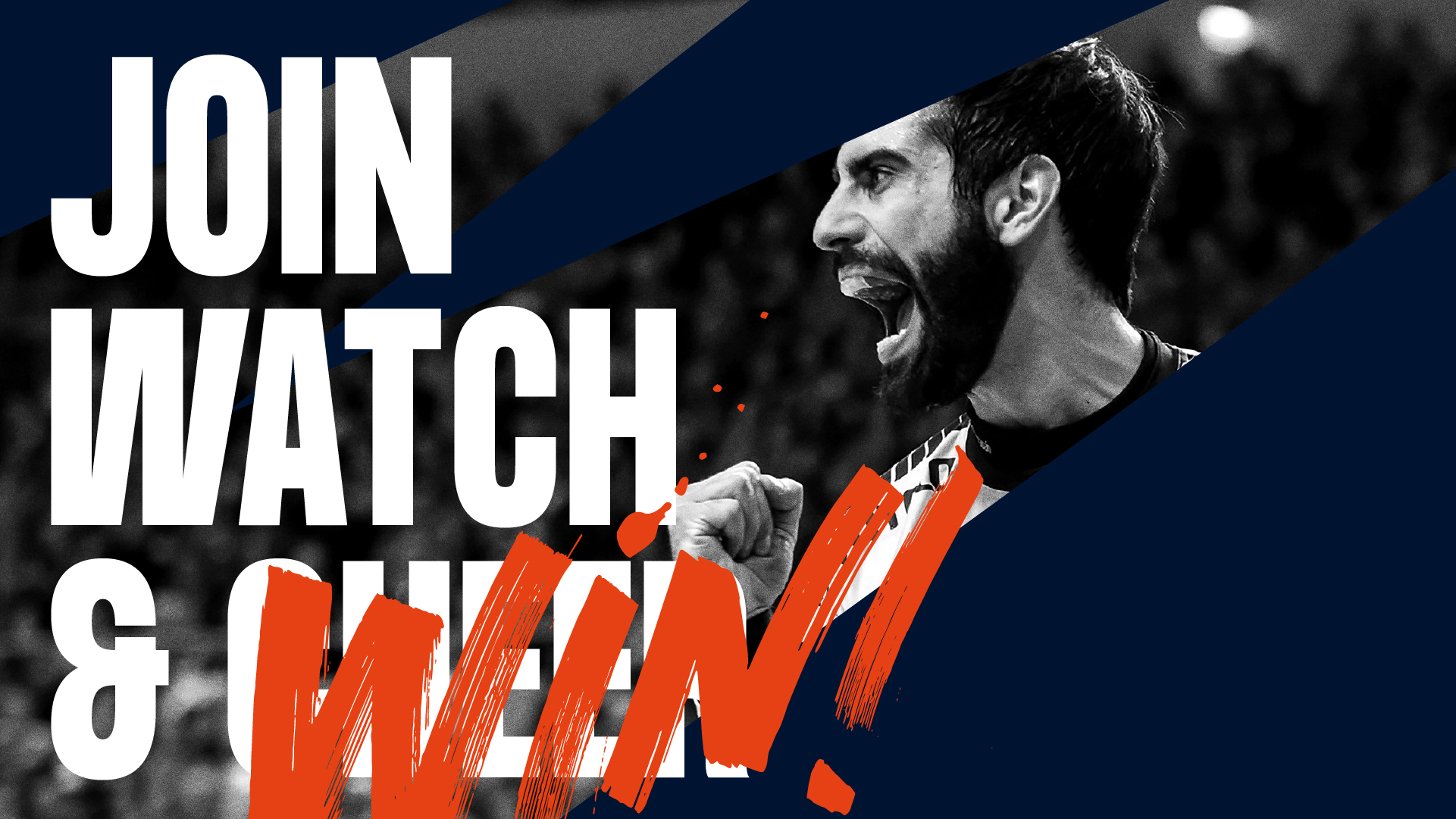
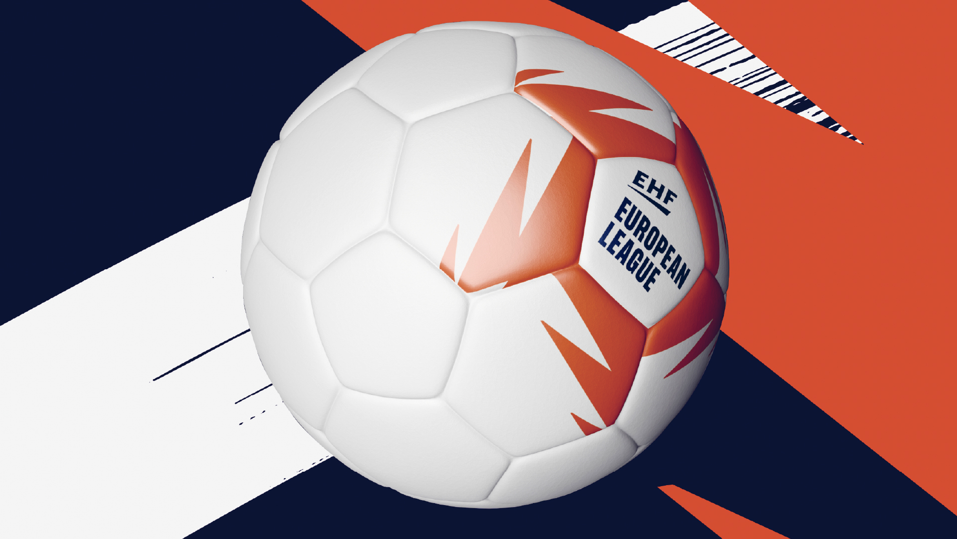
Yet another glimpse of our work for the European Handball Federation (EHF). Today we would like to show you the brand-new EHF European League – formerly known as the EHF Cup (EHF’s second tier club competition).
We have created this identity as a part of the larger EHF umbrella brand system, which we have been working on over the last 12 months.
The new logo is an abstract version of the letter “E”, rotating around the sides of a pentagon. The pentagon, which derives from the shape of a handball tile, is one of the design elements that brings the overall EHF brand system together.


Related news
We are looking for a Strategy & Research Intern
We believe that identity is the only truly sustainable competitive advantage. Everything else can be copied or bought. IDna Group…
Happy Holidays from IDna Group
Once again, we are entering the Holiday season with Covid-19 in our minds and perhaps in our family. What seemed…
Welcome Sara
Say hi to our new Account Manager Sara Mira Qvist Fog, who joined IDna Group this week. She brings vast…
Are you our next project management intern?
We work with identity — both strategically and visually. We help our clients harvest the often underestimated power of their…
