Down to the Wire
Corporate strategy & design for NKT
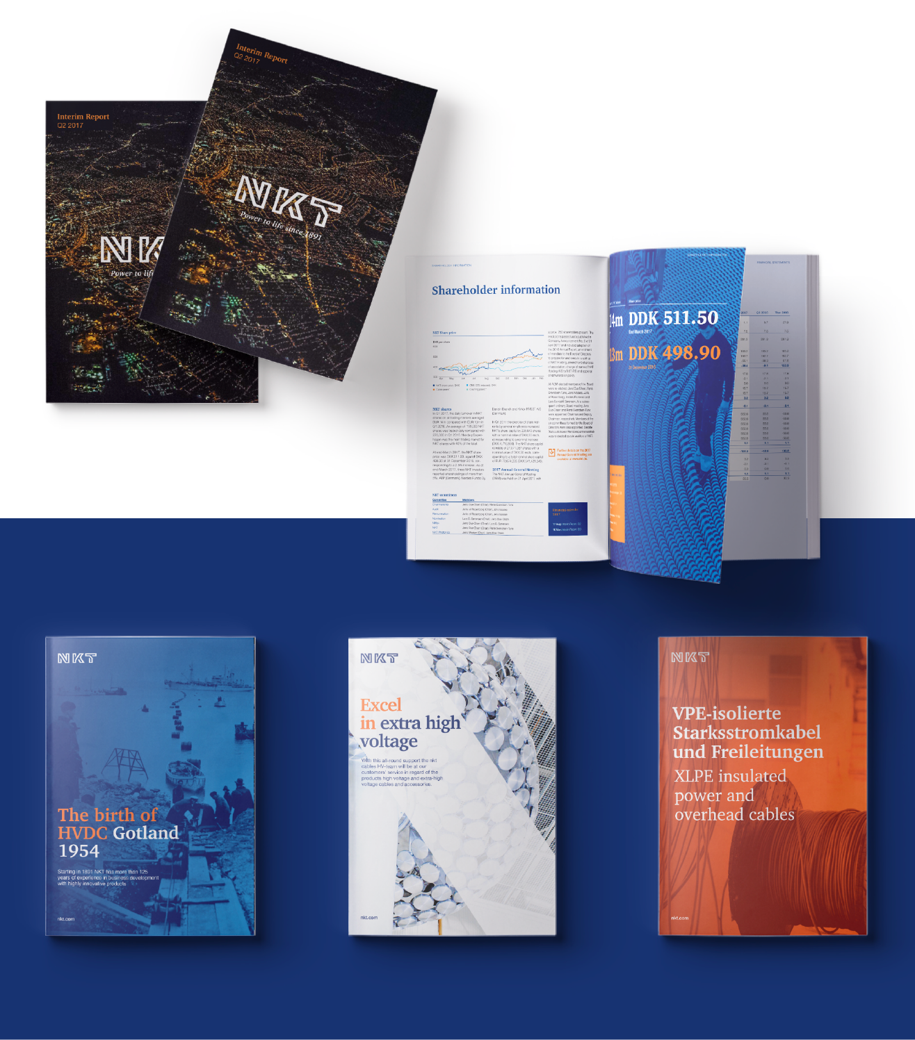
In March 2017 NKT acquired the Swedish company ABB HV Cables. At the same time they changed their name from nkt cables to NKT – hence the need for a new identity. IDna Group helped with strategy and design and rewrote NKT’s core story and created the new identity on top of that.
Project details
The concept behind the updated NKT logo relates to the past, the present, and the future in an increasing level of abstraction. The new logo was presented in March 2017.
The past
The origin of the company; the backbone and the platform for growth for more than a century: cables and cabling. This is illustrated by the lines in each of the three letters and the strong, blue colour.
The present
The transition of the business from component to project-driven was accelerated by the acquisition of ABB HV. The logo illustrates the DNA of a NKT project – from the starting point to the final delivery – all unique, organic (non-linear), and to some extent unpredictable.
The future
The complexity of the future markets and technologies that the updated NKT will operate within underlines our readiness to embrace and drive change in order to succeed. This is illustrated by the complexity in the lines, the spaces, and the optical effect, which creates depth in each letter. The Nordic heritage forms the basis for the chosen visual language and design.
Colours & icons
NKT’s colours help support the identity and provide a recognisable element. The colours are carefully harmonised with each other. For many years, the dark blue colour has been NKT’s primary colour and by maintaining it in the updated logo, the logo is linked back to NKT’s long history. The logo carries undertones of NKT’s proud, Nordic and pioneering heritage, and the colour palette stems from the same DNA.
The bright orange colour invigorates the dark blue colour and creates a good energy and contrast between them. This contrast is important for the identity, which is why the orange colour is featured on several elements throughout the identity. The tertiary colours help bring morelife to the identity and are a reflection of the various materials used in NKT’sproducts, for instance copper and aluminium.
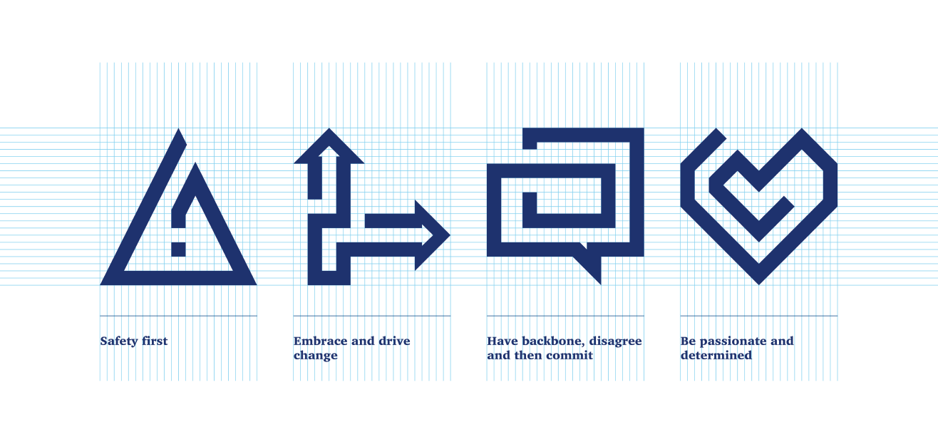
Icons
Icons are a unique language, where each icon is a word or action with its own meaning and can stand on its own or be supported by a short text.
The NKT logo is the backbone and inspiration for the visual language of the NKT icon set. The icons are divided into two categories: Value icons and Purpose icons.