
Reinventing a law firm
Naming & visual identity for Co:Play
In times of digitalisation and tech domination, new opportunities and challenges emerge. In most countries, we have experienced an increased digitalisation of society, and hence we see an increased demand for tech specialised law firms. However, at the same time, automated legal tech offers are on the rise, emphasising the need for highly specialised companies. Our partner Co:Play have just established a new law firm, and they are your new go-to-guys when it comes to law, technology and business.

Project description
We helped Co:Play with positioning, development of their new name and development of the new visual identity. A bold identity that breaks with the conventions and the regular expression that we see in many law firms today, as they are truly different. Founded by seven senior partners with vast experience from national and international law firms, they are highly specialised in their field. They all share the wish to do things differently as they take pride in truly understanding their client, their business and their needs
Co:Play specialises in companies that either sell or invest in technology, such as gaming, AI, Fintech, robotics and so on. Adding to the tech-focus, Co:Play aims to create value with their “no-nonsense” approach in, e.g. pricing and collaboration, and by always challenging the existing. They recognise the law as a means to achieve a business goal or target.
Working together with the Co:Play team has been a quite condensed process. We were on a constant mission to balance their new way of thinking with the credibility and seriousness needed in this rather conservative industry. Throughout the process we experienced that the Co:Play team became bolder and more courageous in their decisions, moving away from their “save-place”, creating space for a new way of expressing law, competencies, and innovative approach.
We have expressed Co:Play’s pursuit in challenging the traditional approach to the legal profession in both the name and the visual identity. The name signals that they have a different approach to clients and that they aim to focus on interaction and collaboration, rather than the traditional client/lawyer relationship. The name derives from the word “co-player”, and Co:Play hereby draws on the connotations of being a peer, an equal and in it for the long run – together. The name is furthermore alive in several of Co:Play’s product names, such as the customer portal Co:space, the document generator Co:ntract and the virtual data room Co:deal.
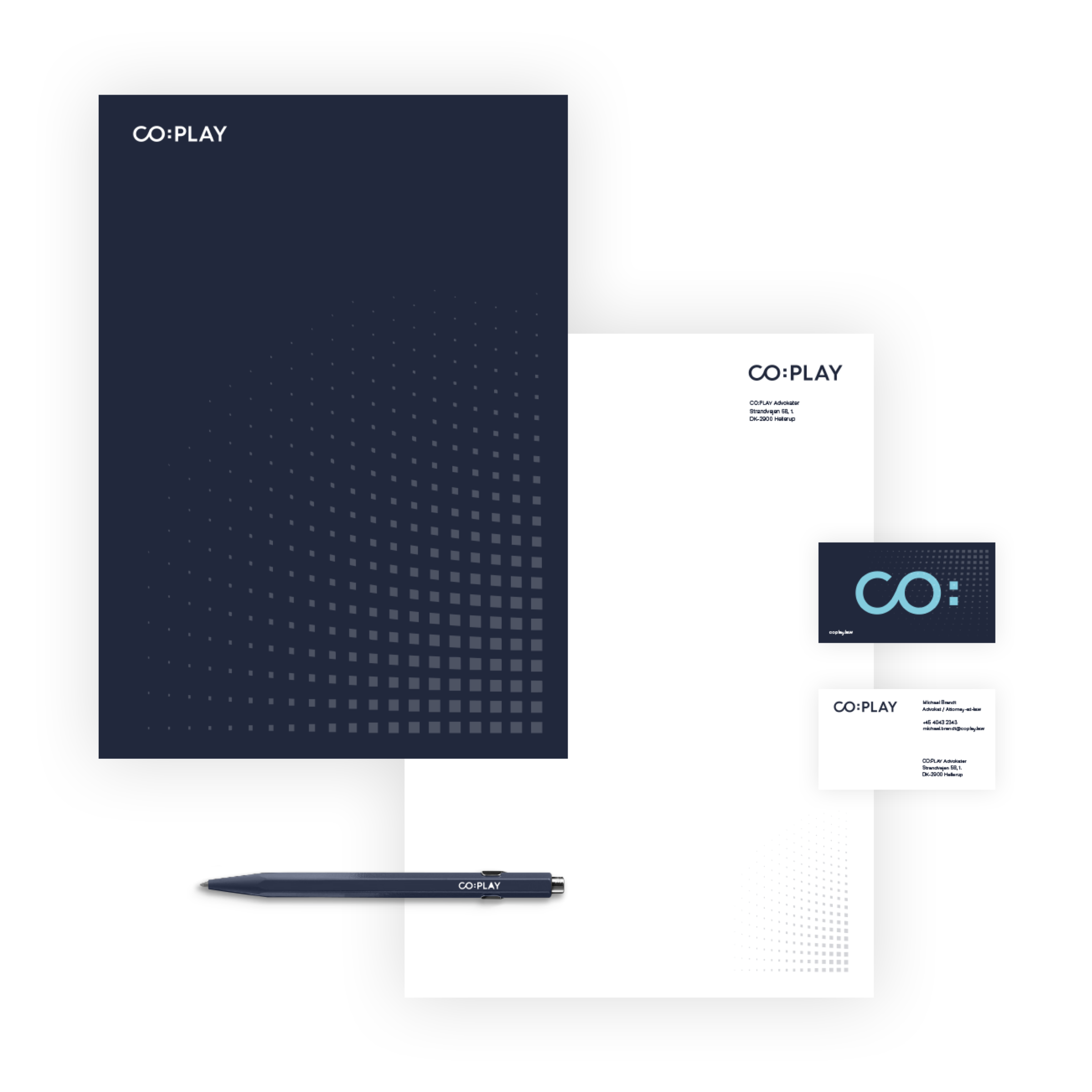
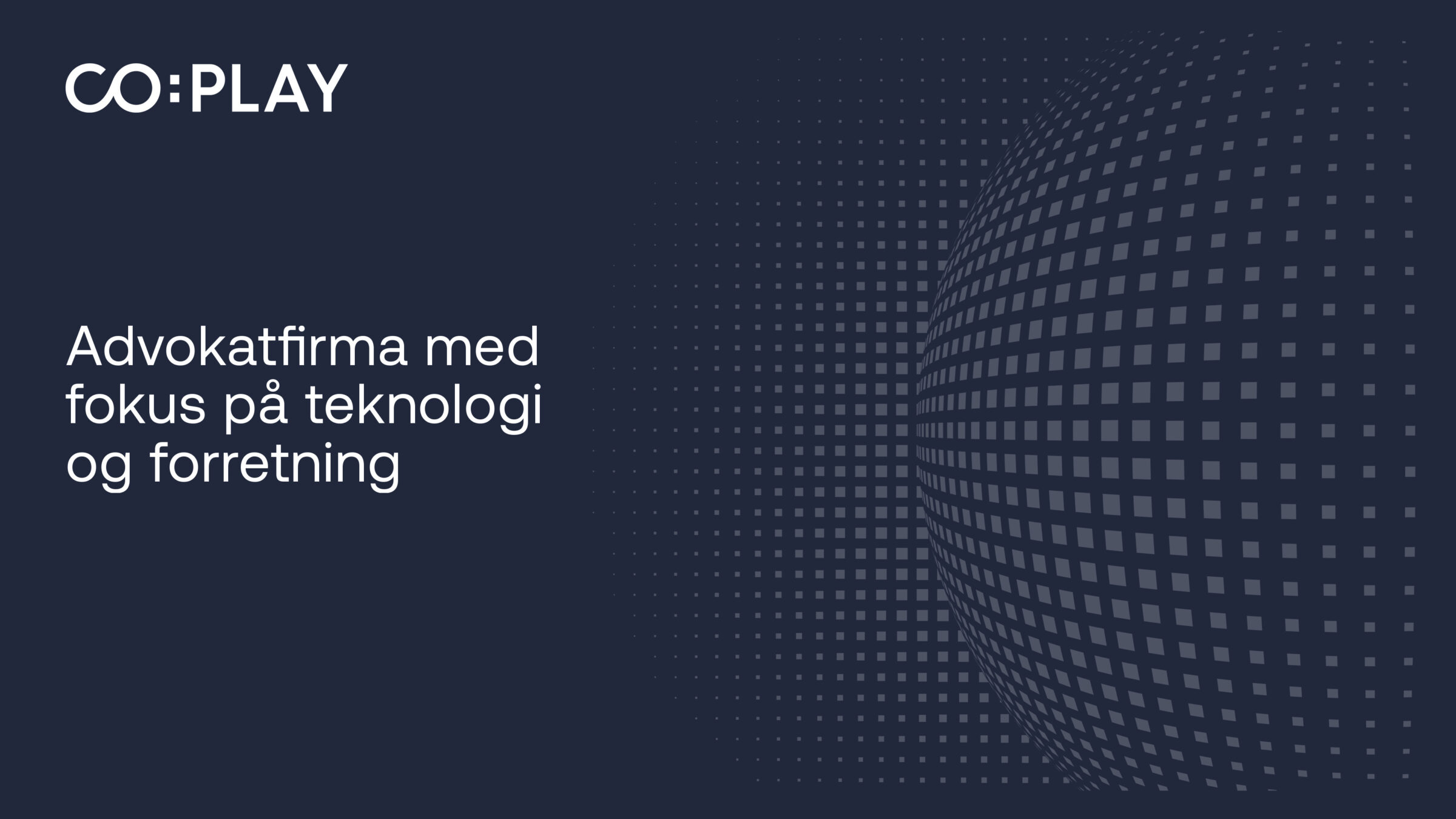
The pixelated colon in the logo is a reference to Co:Play’s area of focus being tech law. These pixels live as a dynamic ID element across many different surfaces and touchpoints throughout the identity.
Contact

Related work
IFPA – Rebranding
Together with IFPA, we conducted a repositioning and rebranding process, activating the inherent identity of the federation for securing their impact against psoriatic disease in the next era.
Dora Nordic – Visual identity
DORA is an anagram of the word road, and it is the promising start-up that rethinks the allocation of goods in freight vehicles. We helped with strategic consultancy and developed their new visual identity.
Byggesocietetet – visual identity
The new visual identity for Byggesocietetet embraces both the traditions and the future that the organization faces while rejuvenating the perception of the industry to attract a younger target group.
econic – Visual identity
The two Dutch companies FCTR E and Zon, joined forces to create an e-home company that will accelerate the transition towards more sustainable heating and energy consumption in European homes. We have created a new visual identity for the new company, econic.