Strains matter
Strategy and visual identity for Chr. Hansen Human Health
Chr. Hansen is a global bioscience company that develops natural solutions for the food, nutritional, pharmaceutical and agricultural industries. They develop and produce cultures, enzymes, probiotics and natural colours for a wide variety of foods, beverages, dietary supplements and animal feed. We have had the opportunity to work closely together with the Human Health team to support this very successful and fast-growing business line in achieving their ambitious goals, and in order to do so, we have had both of our key competencies in play – strategy and design.
Project details
Over the last couple of years, the Human Health division at Chr. Hansen has grown immensely – and according to a press release from January 2019, Chr. Hansen reports solid organic revenue growth of 10 % with an impressive 17 % in the Health and Nutrition area. As CEO Mauricio Graber states in the press release: “We have had a solid start to the year, with Food Cultures & Enzymes delivering strong organic growth with contributions from volume and EUR pricing, in line with our expectations. Organic growth in Health and Nutrition was also strong, driven by global demand for probiotics for infant formula in Human Health.”
Due to the massive growth and a plan to enter new markets, the Human Health team saw a need to revisit the essence of the division in order to develop a tool to ensure guidance and common direction in times with many new employees and massive growth.
We helped Chr. Hansen build a brand house in the Human Health division. While being true to the mother brand, it still allows the Human Health division to have their own Why, How and What, in order to unite the organisation about a common focal point and a common goal. In this process, our goal was to find out what makes this particular division unique – its sustainable competitive advantage.
Although the probiotics market, in general, is moving towards a B2B2C approach, and that the global consumer, now more than ever, is looking for information and online purchase, Chr. Hansen has – after an in-depth strategy process – decided to stay in the B2B market. As a B2B provider, Chr. Hansen has chosen to build upon their unique value proposition, which became an inspiration for our further work in translating the strategy into a visual language. Chr. Hansen’s probiotics are the best scientifically documented probiotics in the world – meaning that strains matter.


The visual identity
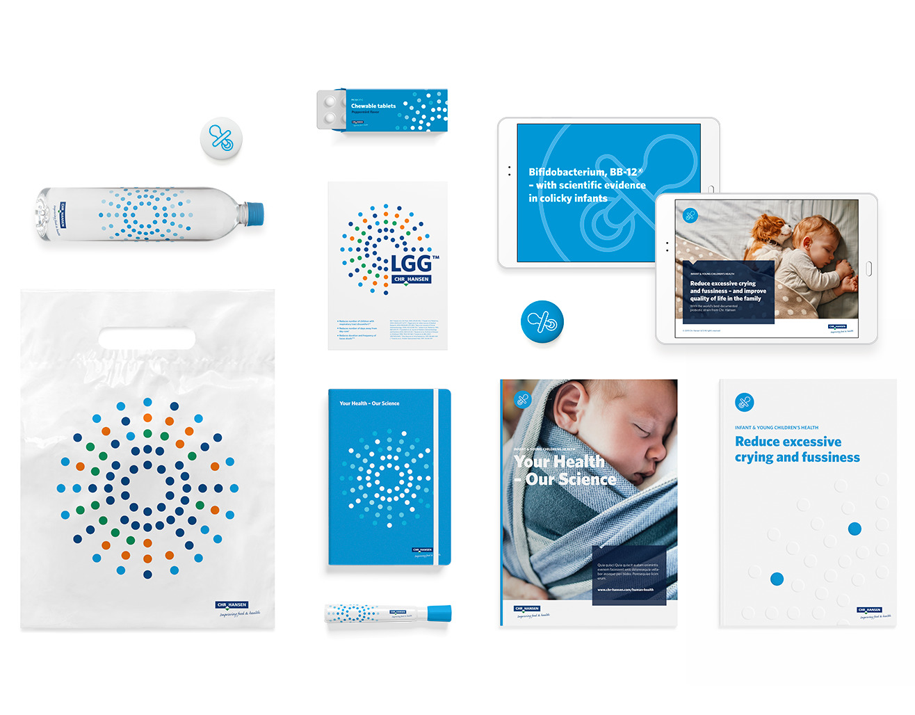
For us, visual identity is the most powerful expression of strategy, as design, when done right, can amplify and enhance the message significantly. And this project has been no exception. With respect for and with a clear link to the mother brand, we have created a new visual identity for the Human Health division in Chr. Hansen based on their most valuable asset – their strains.
Visual identity element
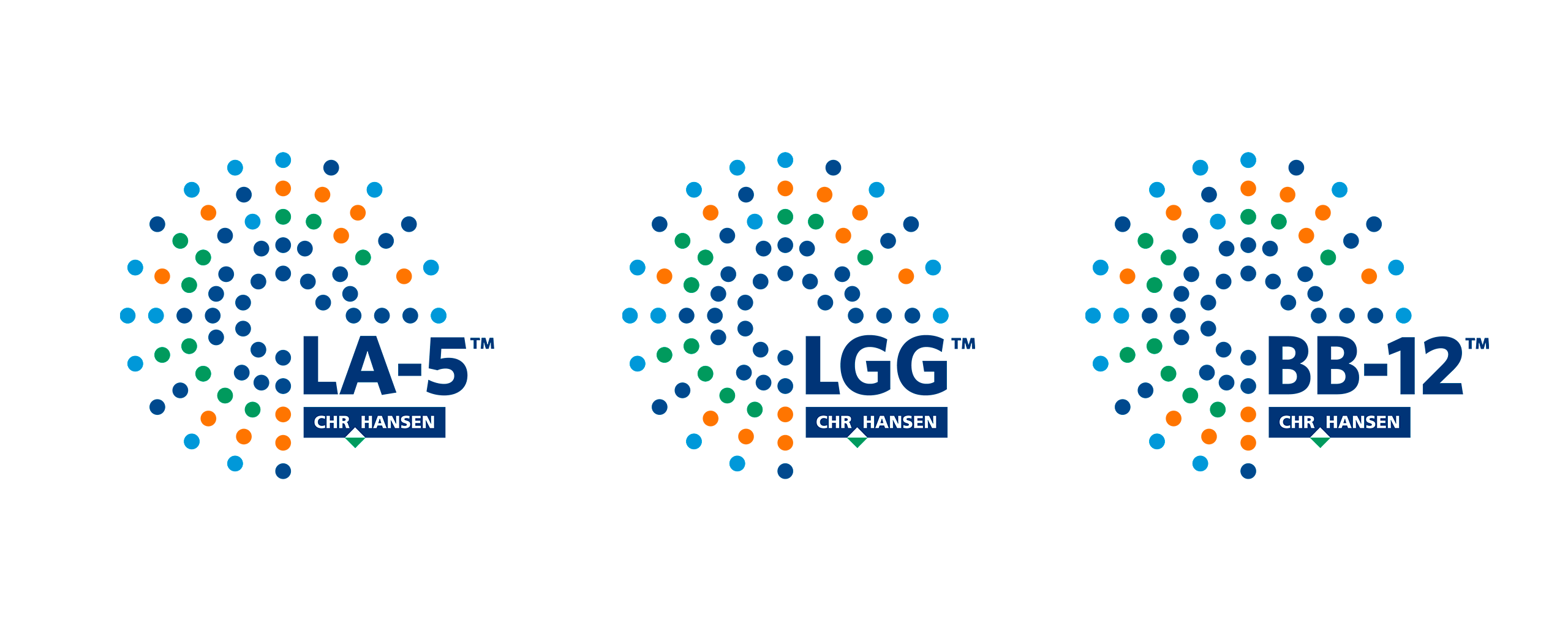
The new visual identity of the new Human Health division builds upon their most valuable asset – their strains. And the key visual element of the new identity is a genome symbol. The shape of the symbol originates from genome sequencing, and the colourful composition of dots in logo blue, logo green, light blue and orange serves as a unique recognizable proprietary graphic element in the Human Health visual identity.
Colours & typography
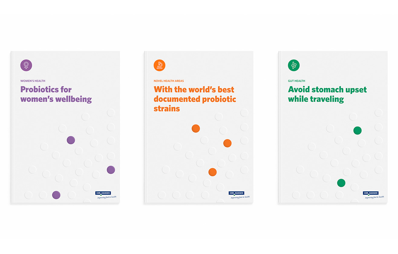
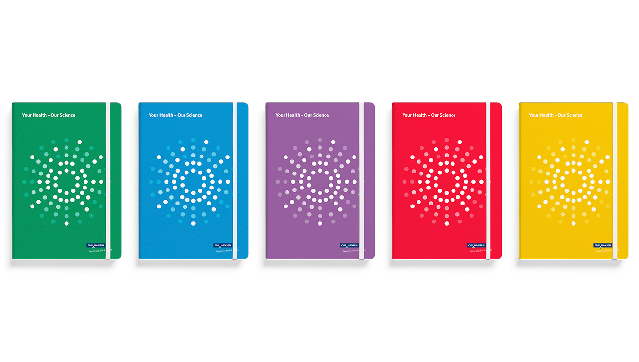
To ensure a close link to the Chr. Hansen corporate brand, the corporate typeface Whitney is also used for the division identity. Furthermore, the colour palette derives from the secondary colours in the corporate identity of Chr. Hansen, while introducing a few new colours such as purple. Each colour is associated with a specific health area, which will help make communication from the specific areas more consistent and recognizable by both internal and external stakeholders.
Icons
Each health area in Human Health has its own unique drawn category icon, to help determine which health area is concerned. Furthermore, we have created a large icon collection that covers everything from business themes to health and balance. All icons are drawn in a single line and can appear in both Human Health area colours and in corporate colours.