
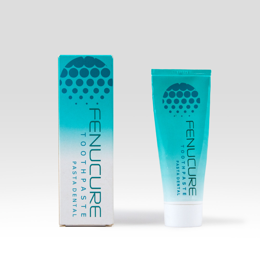
For many years, Fenucure Medical have developed products for oral hygiene based on the seeds from the fenugreek plant. The plant is known for its healing and anti-inflammatory effect and is therefore a natural yet effective remedy for the harmful bacteria causing gum problems.
We have been working closely together with the team at FenuCure – now DentaCure, and marketing consultant Niels Kirkebye, on both a brand strategic and visual level in order to create the best foundation for their expansion – both in regard to new products as well as well as new markets.
The DentaCure products all contains a naturally active extract of fenugreek seeds, which through millennia has been known for its healing effect. Back in 2017, DentaCure was tested by professor Marie Paulis from New Haven University. The test documented that DentaCure has an effective effect on both bleeding gums and gingivitis as well as proved that inflammation of the gums was reduced by using the toothpaste, compared to a placebo toothpaste.
The intersection between the documented clinical approach and the natural ingredient became the focal point of the new brand design as well as the strategic starting point for our work with DentaCure. Strategist Peter Galler shares some of his considerations from the process: “Being a medical company, with an herb as the primary active ingredient, presented a few interesting strategic considerations in regard to positioning. Do we want to be the “effective alternative in the natural shelf” or “natural alternative in the effective shelf”, and how can we counter-balance design to provide an instinctively understandable proposition?”
The design conventions for efficient and trustworthy oral hygiene products became dominant with a clean and white expression, combined with a key visual element telling the brand DNA in a clear and easily decoded symbol.
”The green cross, which is instinctively decoded as ‘pharmacy’ or first aid, encounters an optically 3-dimensional precisely drawn fenugreek plant, whose expression is based on a combination of old medicine books and the precision and technology associated with the extraction and manufacturing process of the patented plant extract. Technology and nature unite in one symbol,” explains senior designer Line Arlander.

The new design has resulted in a clear identity that ensures differentiation at the supermarket shelf while showing the consumers that the products are made from well-documented and effective natural ingredients without any use of chemicals and micro plastics.
The new design is rolling out in the shops over the months to come. We are looking forward to sharing the full case soon.
Contact

Related news
Identity first: The key to lasting strategic impact
Many of us have heard the numbers… 60-70% of all strategies fail. And if we go all the way back…
Company Identity as an enabler for business transformation
diconium was founded in 1995 and has grown into one of the leading players in building e-commerce solutions. In 2020,…
IDna Group Supports SH Group’s Organisational Transformation, Paving the Way for Change of Ownership
IDna Group has supported the organisational transformation of SH Group, a global company offering smart handling technology solutions to the…
Aligning the organisation for transformation and growth
After a busy time with exciting projects, we had the opportunity to reflect on one of our customers’ pervasive challenges.…
Sign up to Insights
We care about your privacy – please read our privacy policy here.