
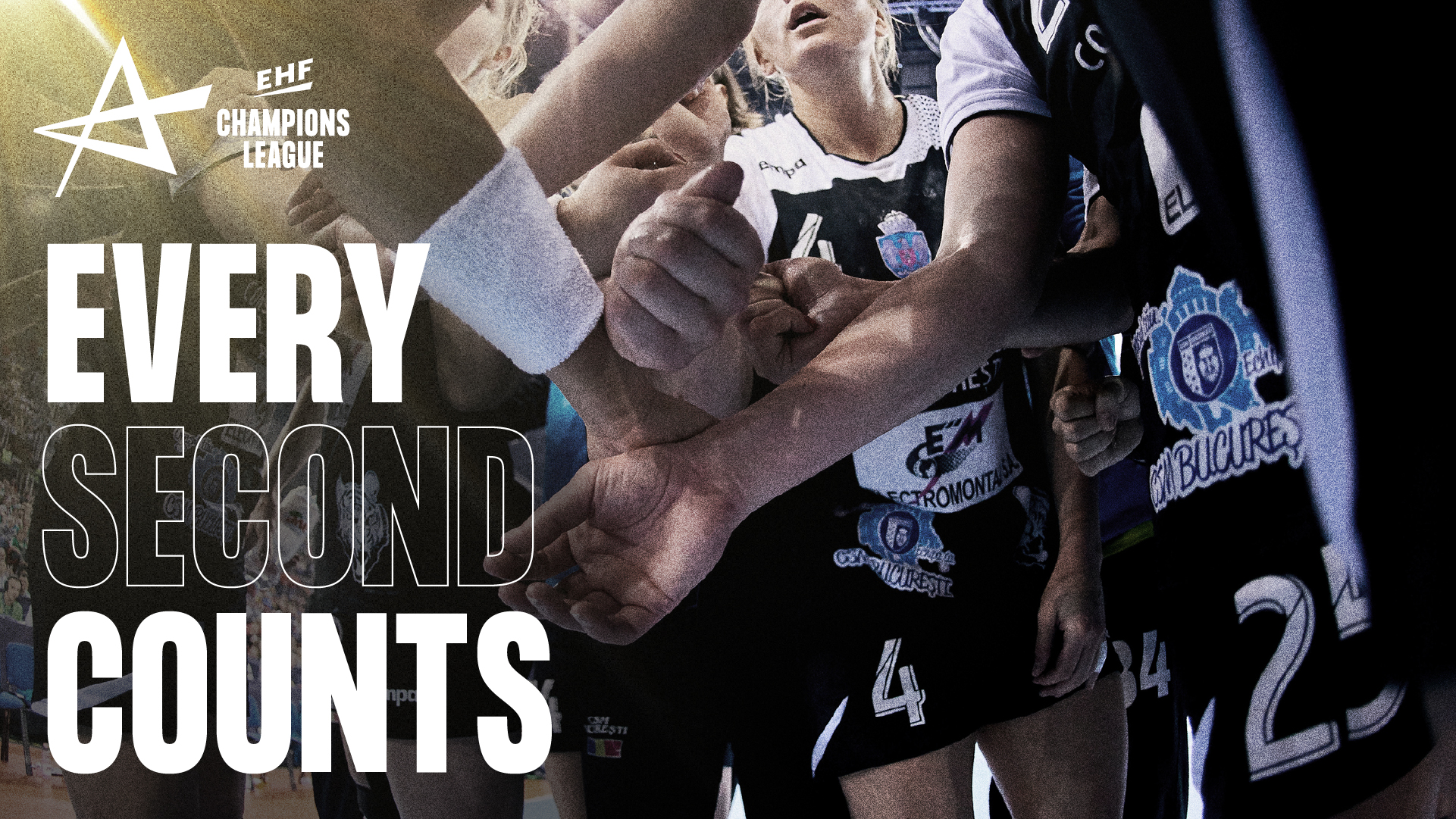
The word is out! We are proud to finally share the first glimpse of the visual identity for the European Handball Federation (EHF) – a total rebrand that we have been working on for more than year.
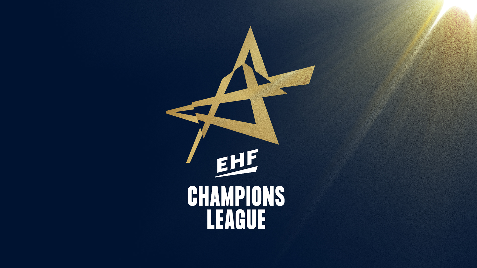
For starters, the new identity for EHF Champions League is revealed. And we can’t wait to show you more of what we’ve been up to for last year or so.
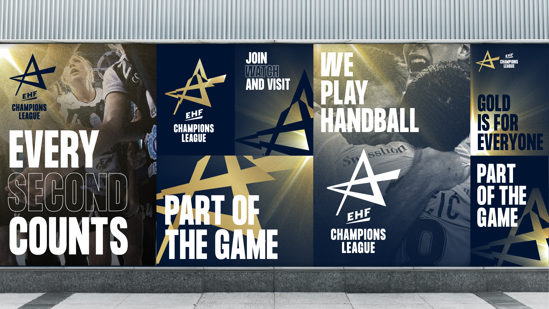
Gold is for everyone
Up until now, the women’s league and the men’s league have had separate colours in the logo – But no more. The golden star will now represent both competitions with sponsor integration being the only differentiating factor.


Thank you for a great partnership on this ride; EHF, EHF Marketing & purpose@heart.
Contact
Related news
Identity first: The key to lasting strategic impact
Many of us have heard the numbers… 60-70% of all strategies fail. And if we go all the way back…
Company Identity as an enabler for business transformation
diconium was founded in 1995 and has grown into one of the leading players in building e-commerce solutions. In 2020,…
IDna Group Supports SH Group’s Organisational Transformation, Paving the Way for Change of Ownership
IDna Group has supported the organisational transformation of SH Group, a global company offering smart handling technology solutions to the…
Aligning the organisation for transformation and growth
After a busy time with exciting projects, we had the opportunity to reflect on one of our customers’ pervasive challenges.…